
Match your directional sun to a physically correct sun-and-sky HDRI first, then build everything else on top of it. Set your exposure with an EV target of roughly 12 to 14 for daylight exteriors, pick a sun elevation that matches your reference photography, and route the render through ACES or Filmic tonemapping before you touch a single fill light. Every other decision, materials, volumetrics, composition, follows from that base.
TL;DR:
- Use a physically accurate sun-and-sky HDRI with matched sun elevation and azimuth to achieve realistic outdoor lighting.
- Prioritize a single directional sun and HDRI as the main light sources, adding subtle area or IES lighting for details, rather than overloading the scene with local lights.
- Adjust colour temperature according to time of day, with midday at 5500-6500K, sunset around 3000-3500K, and overcast skies above 7000K to maintain realism.
- Apply ACES or Filmic tonemapping at the final stage with an exposure target of EV 12-14 for daylight scenes to prevent highlight clipping.
- Keep interior brightness and colour temperature calibrated with exterior lighting and use compositing AOVs to fine-tune reflections, shadows, and atmosphere without re-rendering.
Table of Contents
- What makes exterior lighting CGI look real?
- Which light types should you use outdoors?
- How do you light daylight, overcast, dusk and night scenes?
- Why does tonemapping matter for exterior HDR renders?
- Setting up materials that respond correctly to outdoor light
- How do you use volumetrics without washing out detail?
- Where should you spend render samples on exterior scenes?
- How do studios build reusable exterior lighting rigs?
- What compositing steps finish an exterior render?
- Studio-proven approach: how Visual Trick handles exterior lighting
- How exterior and interior lighting work together in one scene
- What actually separates convincing exterior lighting from the rest?
- Get planning ready and marketing ready exterior CGI from Visual Trick
- Sources
What makes exterior lighting CGI look real?
Realism in exterior lighting CGI comes down to three interlocking variables: direction, colour temperature, and how light bounces between surfaces before it reaches the camera. Get the physics roughly right and the render sells itself. Get it wrong and no amount of post-processing rescues it.
Light direction is the first thing a trained eye reads, often before it registers anything else in the frame. A sun sitting at 15 degrees elevation throws long, raking shadows that read as early morning or late afternoon. Push it to 60 degrees and shadows shorten, contrast drops, and the mood shifts from dramatic to flat midday. Architectural visualisers typically favour a moderate sun angle suitable for marketing stills, which carves out enough shadow definition on facades and rooflines without hiding detail in black.
Colour temperature does the emotional heavy lifting. Daylight sun is typically in the mid-range Kelvin temperatures, golden hour drops to a warmer, lower Kelvin range, and overcast skies push toward higher Kelvin values because the light is scattered and blue-shifted. Mismatch these values against your artificial fixtures and the render looks like two different photographs stitched together, which is exactly what happens when a CGI artist lights a dusk scene with a 6500K sun and forgets the porch lights need to shift warmer to compensate.
Sky models and HDRI environment lights do more than fill the background. They are the scene’s principal source of ambient illumination and, critically, the source of every reflection on glass, water, and gloss paint. Environment lights should be treated as equirectangular HDRIs and aligned precisely with the directional sun so that reflections and shadows agree with each other. If the sun azimuth and the HDRI’s baked sun position differ significantly, it causes shadows and reflected highlights to mismatch, which quickly breaks a render’s credibility.
When you build a custom environment light from a 3D scene rather than a stock HDRI, export it at 32-bit in full equirectangular projection. Anything less clips the dynamic range of the sky and sun, which shows up later as banding or a flat, grey ambient wash across shadowed facades.
Atmospheric perspective, the gradual desaturation and contrast loss with distance, is what separates a render that reads as “big” from one that reads as a diorama. Real air scatters light. Buildings 200 metres away lose micro contrast and shift slightly blue compared with the foreground. Skip this and even a well-lit hero building will look like it’s floating in a vacuum.
Core principles worth locking in before every project:
- Match sun elevation and azimuth to the HDRI’s baked sun position, not just visually, numerically.
- Pick Kelvin values by time of day, not by taste: 5500 to 6500K midday, 3000 to 3500K golden hour, 7000K plus overcast.
- Use atmospheric perspective (haze, desaturation, contrast falloff) to sell scale and distance.
- Treat global illumination bounce as a feature, not noise, since it’s what makes shadowed walls look lit rather than dead.
Pro Tip: Render a grey diffuse “clay” pass of your whole scene under your chosen HDRI before adding a single material. If the shadow falloff and ambient fill already look convincing in flat grey, your lighting rig is sound and any problems later belong to your materials, not your lights.
Which light types should you use outdoors?
The honest answer is: fewer than most beginners think. Exterior scenes lean far more heavily on environment and directional lighting than interiors do, because the sun and sky are already doing most of the work. Adding too many local lights on top usually just muddies the read.
Directional sun light should be your only true “key” light in daylight and overcast scenes. It’s infinite in distance, so it produces parallel shadows and consistent intensity across the whole scene, exactly how sunlight behaves in reality. HDRI environment lighting supplies the ambient fill and every reflection cue. Everything else is refinement.
Area lights earn their place as local fills, bouncing light back into deep shadow pockets under eaves, balconies, or recessed entrances where the HDRI’s ambient contribution alone reads too dark. Keep these subtle. An area fill that’s visible as its own light source rather than a gentle lift in the shadows has usually been pushed too hard.
IES light profiles are essential once you introduce fitted luminaires, bollard lighting, wall-mounted downlights, garden spotlights, because they encode the actual photometric distribution of a real fixture rather than a generic cone or sphere falloff. A generic point light throws an even, characterless glow. An IES-driven light throws the same asymmetric, slightly uneven pool of light a real fixture would, complete with the hot spot and falloff pattern manufacturers actually publish. For hero shots where a lit facade or garden path is doing marketing work, that difference is visible even to non-technical clients.
Emissive geometry, glowing window glass, illuminated signage, neon strip detailing, is the right call when the light source itself needs to be visible in reflections and in camera, not just cast illumination. A window that’s “lit” only by a hidden point light behind the glass will look dark in reflections; an emissive material on the glass itself solves that instantly.
Light linking and light portals become necessary once a scene gets complex enough that lights start leaking where they shouldn’t; a garden spotlight bleeding onto a neighbouring facade, or an interior light spilling exterior illumination through a window in a way that fights your night exterior mood. Light linking restricts which objects a given light source actually affects. Portals, meanwhile, help renderers understand how much light is entering through a window or doorway from outside, which speeds convergence dramatically in interior-exterior combined scenes.
- Directional sun and HDRI: primary light source for 80 to 90% of daylight and overcast scenes.
- Area lights: shadow fills only, kept subtle enough that they’re felt, not seen.
- IES profiles: any fitted, real-world luminaire where photometric accuracy matters to the shot.
- Emissive geometry: any light source that must appear correctly in direct view or reflection.
- Light linking and portals: control leakage and speed convergence once scenes combine interior and exterior sources.
How do you light daylight, overcast, dusk and night scenes?
Each time of day needs its own recipe, not a single rig nudged slightly. Treating day, overcast, sunset, and night as genuinely separate lighting problems, rather than variations on one master setup, is the fastest route to consistent quality across a project.
1. Daylight. Start with an HDRI that matches your target season and latitude as closely as possible; a summer European sky and a winter Scandinavian sky behave very differently in both colour and elevation. Set the directional sun to align exactly with the HDRI’s baked sun position. Target an exposure typical for clear day exteriors, adjusting as needed for overcast conditions. Add subtle area-light bounce fills only where the HDRI’s ambient contribution leaves recessed areas reading too flat or too dark.
2. Overcast. The defining challenge here is contrast, or the lack of it. A fully overcast sky is a giant, even softbox, which is beautiful for even material read but disastrous for depth and focal hierarchy. Compensate with local relighting: a subtle rim or accent light on the hero building’s leading edge, or a slight warm bounce card effect near the entrance, restores a sense of where the eye should land. Push your Kelvin value up toward 7000K or beyond to capture the blue cast overcast light genuinely has, then use selective desaturation in grading rather than flattening the whole image to grey.
3. Sunset and dusk. This is where colour temperature contrast does the most storytelling. Key light warms during sunset and dusk, while the sky’s residual blue creates a natural warm-cool contrast that reads as cinematic. Rim lighting along building edges facing the sun becomes far more pronounced at low sun angles, use it deliberately to separate the silhouette from the sky. Watch highlight handling closely here: a low sun disc is one of the brightest single points in any render, and it will blow out your tonemapping curve if you don’t cap or control its intensity relative to the rest of the scene.
4. Night. Night exteriors are an exercise in balancing multiple discrete sources rather than one dominant key. Street lighting, fitted IES fixtures, interior window glow, and moonlight (typically a very dim, cool-toned directional light around 4000K) all need individual attention. Interior-to-exterior balance matters enormously here: if interior rooms are lit for their own sake at full daylight-equivalent brightness, every window becomes an overexposed white rectangle. Bring interior exposure down relative to what you’d use for a standalone interior shot, and let window glow read as warm and inviting rather than blown out. Lens effects, bloom around bright fixtures, subtle glare on wet pavement, do a lot of the emotional work in convincing night renders, but they belong in composite, not baked into the render itself.
When something looks wrong in any of these four scenarios, work through this checklist before touching materials:
- Confirm sun and HDRI sun position actually match numerically, not just by eye.
- Check exposure against your EV target rather than trusting the render preview’s auto-exposure.
- Look for one dominant light source reading as “the story” of the shot; too many competing sources of equal weight is the most common night-scene failure.
- Verify Kelvin values across every light in the scene are consistent with the stated time of day.
Why does tonemapping matter for exterior HDR renders?
Because unmanaged HDR data blows out skies and clips highlights long before it reaches anything resembling a photograph. A raw linear render of an exterior scene under a bright sun regularly produces values well beyond what an 8-bit display can show, and without deliberate tonemapping, that excess simply clips to flat white.
ACES or Filmic tonemapping is the standard fix, and it belongs at the very end of your render pipeline, applied to the final linear output before any colour grading, not baked in earlier. Both systems compress highlight values in a way that mimics how film and the human eye handle extreme dynamic range: gently rolling off rather than clipping hard. Tonemapping is widely recommended specifically to manage high dynamic range from sun and sky and avoid blown highlights in exterior work, and the difference is immediately visible in any shot containing open sky.
Exposure targets matter just as much as the tonemapper you choose. For a typical clear daylight exterior, aim for an EV of 12 to 14 measured at the camera. Push much higher and even ACES will start losing separation in the brightest cloud detail; push lower and the whole image reads underexposed no matter how the tonemapper compresses highlights.
Working in a proper linear colour space throughout the pipeline, not just at the tonemapping stage, is non-negotiable. This means your 32-bit HDRIs, your material albedo values, and your lighting calculations all need to happen in linear light before any gamma correction or display transform touches the image. Mixing gamma-corrected textures into a linear lighting calculation is one of the most common causes of muddy, slightly-off-colour renders that artists struggle to diagnose.
- Apply ACES or Filmic tonemapping at the final output stage, never earlier in the pipeline.
- Target EV 12 to 14 for daylight exteriors, adjusting per scene brightness.
- Keep HDRIs and materials in 32-bit linear space until the final display transform.
- Use a LUT sparingly after tonemapping for stylistic grade, not to fix exposure problems that belong further upstream.
Statistic callout: without tonemapping, a clear midday sky in a physically-based render routinely exceeds the dynamic range an 8-bit image can display, which is precisely why ACES and Filmic exist as a standard step rather than an optional polish.
Setting up materials that respond correctly to outdoor light
Materials that look convincing under a studio three-point rig often fall apart the moment they’re dropped into full sun and sky illumination, because outdoor light is unforgiving about energy conservation errors that indoor lighting hides.
Albedo values need to stay within a realistic reflectance range, generally between 4% and 90% for real-world materials, rather than the pure black-to-white range a texture artist might be tempted to paint. Concrete pavement sits around 20 to 40% reflectance depending on age and staining; fresh render or painted render can reach 70 to 85%. Push albedo too high and the material starts reflecting more light back than physically possible, which reads as an unnatural glow under bright directional sun even when nothing else in the setup is wrong.
Vegetation is the single material category that trips up more exterior renders than any other. Leaf shaders pushed toward saturated, cartoon greens look fine in isolation but break the moment sunlight hits them, because real foliage has significant translucency and a much narrower, more desaturated green range than most default shader presets assume. Adding subsurface scattering to leaf materials, even a small amount, restores the backlit glow that makes trees read as alive rather than as green cardboard cutouts.
Microvariation in roughness separates a photoreal render from an obviously synthetic one at close range. Real pavement isn’t uniformly rough; it has patches of polish from foot traffic, grime buildup in low spots, and rain staining that shifts roughness locally. The same applies to brick, where mortar lines typically carry a different roughness value from the brick face itself, and to glass, where a perfectly clean roughness-zero pane looks like a mirror rather than real glazing.
- Keep albedo within realistic reflectance ranges for the material category rather than trusting the texture alone.
- Add subtle subsurface scattering to foliage shaders to avoid flat, oversaturated greens under direct sun.
- Break up roughness with procedural or painted microvariation on pavements, brick, and glass.
- Match artificial fixture colour temperature to the time of day you’re rendering, since a warm sunset scene needs warmer fixtures than the same building shot at midday, a detail that Kelvin mismatches expose almost instantly.
How do you use volumetrics without washing out detail?
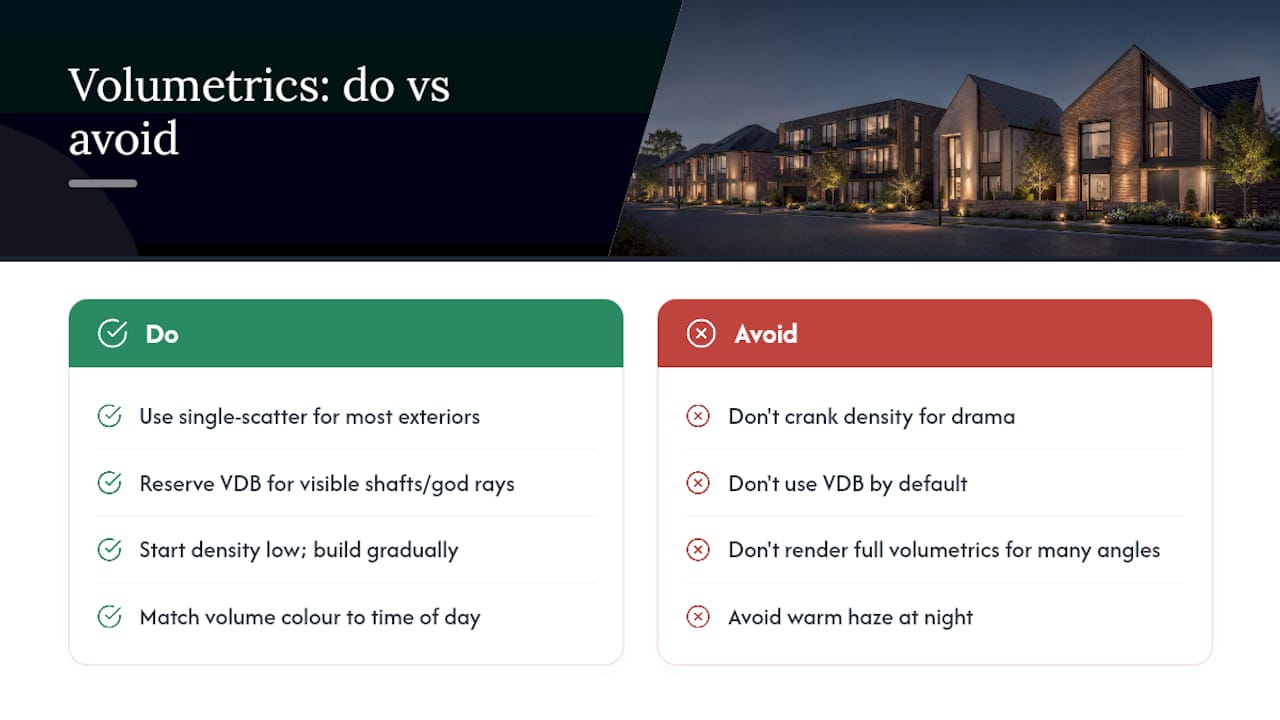
Atmospheric scattering sells depth, but it’s the fastest way to ruin a render if you reach for maximum density as a default. The goal is a light veil that pushes distant elements back, not fog that erases the building you’re supposed to be showcasing.
For most exterior work, a single-scatter volumetric setup is sufficient and considerably cheaper to render than a full multi-scatter VDB volume. Reserve VDB volumes for scenes where you genuinely need visible light shafts through trees or between buildings, god rays at a low sun angle being the classic case, because that effect depends on multiple scattering events to look convincing rather than flat.
Start density low. A common beginner mistake is dialling in atmospheric density until it looks dramatic in a test render, then discovering it’s crushed all the fine architectural detail in the mid-ground once the final lighting and materials are in place. Build density gradually while checking against a reference photograph taken at a similar time of day and distance.
Colour and density should shift with time of day just as deliberately as your key light does. Midday haze reads close to neutral grey-blue. Sunset atmosphere should pick up warm scattered light from the low sun, sometimes a subtle orange-pink cast in the volume itself, which is part of why golden hour renders feel so atmospheric even before grading. Night atmosphere, by contrast, should stay minimal and cool, since most visible “atmosphere” at night comes from light interacting with humidity or particulates near street lamps rather than a general haze.
Performance is the practical constraint that decides whether you render true volumetrics or fake the effect in composite. Full volumetric scattering across a large exterior scene, especially with multiple light sources casting into the volume, can add substantial render time. For static hero shots, real volumetrics are worth the cost. For high-volume marketing work with many similar angles, a cheap depth-based fog pass added in compositing frequently gets 90% of the visual benefit at a fraction of the render time.
Pro Tip: Render your volumetric pass as a separate AOV wherever your renderer supports it. If a client asks for more or less atmosphere after review, adjusting a comped fog layer takes minutes; re-rendering baked volumetrics can cost hours.
Where should you spend render samples on exterior scenes?
Not evenly, and definitely not by simply cranking a global sample count until noise disappears. Exterior scenes concentrate their noisiest, most sample-hungry problems in a small number of predictable places, and knowing where they are saves substantial render time.
-
Prioritise samples toward small, bright light sources first. A tiny sun disc, a fitted spotlight, or a thin sliver of sky visible through foliage all produce disproportionate noise relative to their screen area, because so few samples actually hit them per pixel. Adaptive sampling settings that let the renderer allocate more effort to noisy regions automatically will nearly always outperform a flat sample count applied everywhere.
-
Watch shadow-casting edges specifically, since hard-edged shadows from directional sun light are where noise is most visually obvious to a viewer, far more than noise in a flat, evenly-lit wall.
-
Build a denoiser and AOV workflow rather than relying on brute-force sampling alone. Export separate albedo, normal, and lighting AOVs so your denoiser has the guide data it needs to distinguish real detail from noise, rather than denoising the flattened beauty pass directly and risking soft, waxy results on foliage and fine architectural trim.
-
Use proxies and instances aggressively for repeated geometry – trees, paving units, railings, rather than modelling and lighting every instance as unique geometry. This cuts both render time and memory overhead substantially on large exterior scenes.
-
Bake global illumination where the scene is static across multiple render angles, since recalculating full GI for every camera position on an unchanging building is wasted computation once a baked solution will do.
How do studios build reusable exterior lighting rigs?
Rebuilding a lighting setup from nothing on every project is the single most avoidable time cost in exterior CGI work. Procedural approaches that model lighting goals and constraints systematically, rather than placing every light by hand, have been shown to generate arrangements that satisfy both aesthetic and structural requirements even on complex buildings, which is the same logic that makes reusable rig packages worthwhile at a smaller, practical scale.
A practical rig package for a studio typically bundles: a small library of pre-aligned sun-and-sky HDRIs covering the standard scenarios (clear midday, overcast, golden hour, blue hour, night), matched sun angle presets for each, a tonemapping LUT set tuned for the studio’s house style, and a standard AOV export template so every project produces compositing-ready passes without reconfiguring them from scratch.
Naming and versioning matter more than they sound like they should. A rig folder named simply “exterior lighting” becomes useless within a month once a studio has produced dozens of projects. Naming conventions that encode time of day, HDRI source, and version number, something like ext_daylight_clear_v03 or ext_dusk_goldenhour_v02, let any artist on a team pick up a prior project’s rig and know immediately what it contains without opening the file.
- Standard scenario coverage: daylight, overcast, golden hour, blue hour, night, each with its own HDRI and sun angle preset.
- Consistent tonemapping LUTs per scenario, tuned once and reused rather than re-graded per project.
- A fixed AOV export template so compositing steps don’t need reinventing each time.
- Clear naming and version conventions so any team member can identify a rig’s contents at a glance.
What compositing steps finish an exterior render?
The render is rarely the final image, and treating it as one leads to reshoots that a five-minute comp adjustment could have avoided. A well-planned AOV export turns most lighting notes into compositing fixes rather than re-renders.
Essential AOVs for exterior work include a separate diffuse and specular pass, an ambient occlusion pass for contact shadow control, a depth pass for atmospheric grading and selective focus, and a shadow-only pass that lets you dial shadow density independently of everything else. Together these give a compositor genuine control over the final balance without touching the 3D scene at all.
Selective relighting in comp, boosting a window glow, deepening a shadow under an eave, nudging a rim light’s intensity, relies entirely on having those AOVs available. Bloom and glare around bright sources, sun discs, fitted lights at night, streetlamp halos, should almost always be added in composite rather than baked into the render, since it gives far more control over intensity and falloff after the fact.
A re-render becomes unavoidable when the fix needed isn’t achievable from the AOVs you have. Wrong sun angle, a fundamentally mismatched HDRI, or a light leaking through geometry it shouldn’t reach all require going back to the 3D scene. Everything short of that belongs in comp.
- Export diffuse, specular, ambient occlusion, depth, and shadow AOVs as standard on every exterior project.
- Add bloom, glare, and halo effects in composite, not baked into the render.
- Use depth passes for atmospheric grading rather than baking fog permanently into beauty passes.
- Reserve full re-renders for genuine 3D-level errors: wrong sun position, mismatched HDRI, or light leaks.
Studio-proven approach: how Visual Trick handles exterior lighting
Exterior lighting choices on a planning-related visual carry more weight than they do on a purely decorative marketing image, because a planning officer or committee member is reading the shadow angles and material tones for accuracy, not just impression. Visual Trick builds its exterior lighting rigs around this distinction: planning-ready visuals need defensible sun positions and honest material reflectance, while marketing imagery for the same development can lean into a more atmospheric golden hour or dusk treatment.
That dual requirement shapes how the studio approaches every exterior brief:
- Sun angle and shadow direction are checked against the site’s actual orientation and time of application, not chosen for visual drama alone, when the deliverable supports a planning application.
- Marketing stills for the same scheme often get a separate lighting pass, typically golden hour or dusk, once the planning-accurate version has been signed off.
- Material and vegetation setups are kept consistent across both versions, so the building itself never looks like two different projects depending on which image a viewer sees.
- Interior and exterior lighting are balanced together on dusk and night shots, since a badly exposed window undermines an otherwise convincing exterior far faster than most other errors.
Readers commissioning exterior work from any studio should expect this same separation between planning accuracy and marketing atmosphere to be made explicit at the brief stage, rather than discovered after delivery.
How exterior and interior lighting work together in one scene
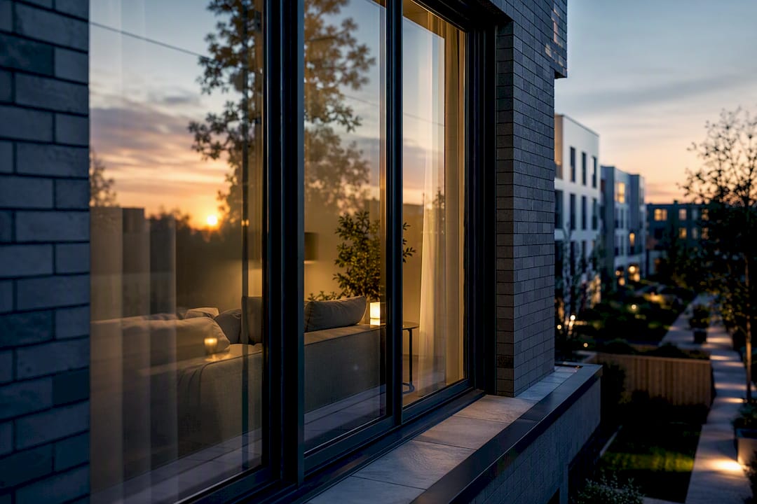
Dusk and night exteriors almost always include visible interiors through glazing, and this is where a lot of otherwise strong exterior work falls apart. The two lighting systems have to be balanced against each other deliberately, because they were never designed to share a frame.
Interior lighting, if lit to its own standalone brief, tends to sit at a brightness and colour temperature suited to an interior shot on its own: warm, evenly lit, exposed for detail. Drop that same interior exposure behind glass in a dusk exterior and every window becomes a blown-out rectangle that fights the exterior’s careful highlight control. The fix is to treat interior brightness as a variable subordinate to the exterior grade, not an independent decision. Interior exposure typically needs to sit noticeably lower than it would in a standalone interior render once it’s viewed through glazing at dusk or night.
Colour temperature consistency matters just as much. Warm tungsten-style interior lighting against a cool blue dusk sky is a classic and effective contrast, provided both sides are deliberate rather than accidental. Problems arise when an artist lights the interior in isolation, then lights the exterior in isolation, and only notices the mismatch once both are composited together.
Reflections are the final piece. Glass doesn’t just show what’s behind it; it reflects the exterior environment back at the viewer, sky colour, nearby trees, the sun itself at certain angles. Getting both the transmitted interior glow and the reflected exterior environment correct on the same pane of glass, in the same render, is one of the more technically demanding balancing acts in exterior CGI, and it rewards careful AOV separation in comp far more than trying to nail it entirely in the render.
What actually separates convincing exterior lighting from the rest?
Most articles on this subject treat lighting as a technical checklist: get the sun angle right, pick a tonemapper, done. That undersells what actually separates a convincing exterior render from a merely correct one. Correct lighting and convincing lighting are not the same thing, and the gap between them is almost always about restraint rather than additional technique.
The recipes in this piece will get any competent artist to physically plausible. What gets a render to genuinely convincing is knowing which imperfections to leave in. Real exteriors have inconsistent roughness, slightly uneven shadow density from atmospheric scattering, glass that’s never perfectly clean, and light that bounces unevenly off surfaces that aren’t quite where a CAD model says they are. Artists who chase mathematical perfection in every value often produce renders that look more artificial than ones with a few deliberate, physically-motivated flaws left in.
The other underestimated point: scenario-based practice beats generalised practice. Treating day, overcast, dusk, and night as four separate skills to build, rather than one lighting skill applied four ways, produces measurably better results faster, largely because each scenario punishes different mistakes and rewards different instincts.
Build a small test scene. Light it four ways using the recipes above. Compare them side by side before you ever apply the technique to a paying project, and keep whichever preset actually holds up under scrutiny as your studio’s baseline going forward.
— Paride
Get planning ready and marketing ready exterior CGI from Visual Trick
Visual Trick turns the recipes above into delivered images, without the trial-and-error render time it takes most in-house teams to get a rig production ready. Every exterior scene is built around the same principle covered throughout this piece: sun and HDRI aligned first, materials and atmosphere calibrated second, tonemapping locked before grading, so the images stand up under scrutiny from planning officers as easily as they catch a buyer’s eye in a brochure.
Visual Trick handles this across a specific set of recurring scenarios: planning application visuals where shadow accuracy and material honesty matter more than drama, marketing stills for property developers and estate agents where golden hour and dusk treatments do the selling, and architect-facing design development imagery where consistency across multiple angles is the priority. If your next exterior project needs either accuracy or atmosphere, or genuinely both from the same building model, get a quote for architectural CGI and describe the brief; Visual Trick will tell you straightforwardly which lighting approach the deliverable actually needs.
Sources
- Procedural Design of Exterior Lighting for Buildings with Complex Constraints
- Post-processing effects: tone mapping (Unity Learn)
