
For UK property portals, work in landscape, with 3:2 and 4:3 as your two core shapes. Rightmove guidance is usually quoted as 3:2 and Zoopla as 4:3, so the safest routine is to render or shoot one master and export both crops. For websites, brochures and social media the answer changes by placement, and this guide gives you the ratio, the pixel size and the reasoning for each one.
The advice applies to photographs and to CGI alike. With CGI you have an advantage: the camera frame is chosen before the image is made, so the ratio can be built in rather than cropped in later.
TL;DR
- Aspect ratio is the shape of an image (width:height). It is separate from resolution, which is the pixel count.
- Portal listings are landscape. Guides quote 3:2 (1024 × 683 px) for Rightmove and 4:3 (1024 × 768 px) for Zoopla, so supply both crops and check each portal’s current upload guidance.
- Avoid portrait and 16:9 images in listings: they get cropped or sit inside white or black bars.
- Frame your master image with spare space around the subject, so every crop still works.
- Crop first, then resize to the target pixel size. Never stretch an image to fit.
Table of Contents
- What aspect ratio means, and what it does not
- The ratios you will meet in property work
- Property portals: 3:2, 4:3 and why you need both
- Websites: pick one ratio and stick to it
- Brochures, hoardings and print
- Social media
- Planning submissions: ratio is about accuracy, not shape
- Cropping and resizing without damage
- Our perspective
- Commissioning images in the right shapes
- FAQ
- Sources
What aspect ratio means, and what it does not
An aspect ratio is the proportional relationship between an image’s width and height, written as width:height. PetaPixel explains that it describes shape rather than resolution, so two cameras can share a ratio and still produce different pixel counts.
Tamron gives a clean example: a 1920 × 1080 photo and a 3840 × 2160 photo are both 16:9, but the second has four times the resolution.
That distinction matters in property work. A large CGI file in the wrong shape will still be cropped by a portal. A small file in the right shape will look soft but sit correctly. You need both right, and the ratio is the one that is hardest to fix afterwards.
How to calculate a ratio
Divide both dimensions by their greatest common divisor. A 1920 × 1080 image has a divisor of 120, which gives 16:9, as Ratilio’s guide shows. To find a missing height, use: height = width × ratio height ÷ ratio width. For a 16:9 image 1280 px wide, that is 1280 × 9 ÷ 16 = 720 px.
A quick shortcut: divide width by height. About 1.5 is 3:2, about 1.33 is 4:3, about 1.78 is 16:9. A rounded decimal can hide an odd ratio, so use the divisor method when the exact figure matters.
The ratios you will meet in property work
| Ratio | Typical use | Notes |
|---|---|---|
| 3:2 | DSLR and mirrorless output, Rightmove guidance, web blog images | Original 35 mm film proportion |
| 4:3 | Zoopla guidance, phones, Micro Four Thirds cameras | Slightly taller than 3:2 |
| 16:9 | Website hero banners, video, presentations | Too wide for most listing slots |
| 1:1 | Social posts, thumbnails | Square |
| 4:5 | Portrait social posts, some architectural photography | Tall |
| 3:1 | Wide website banners | Needs deliberate composition |
Adobe notes that 3:2 is the proportion of 35 mm film, which is why it is so common in digital photography. Its separate page on aspect ratios in photography adds that full-frame and APS-C cameras have 3:2 sensors, while smartphones and Micro Four Thirds cameras shoot 4:3.
Architectural photographers also use 4:5. Place Photography describes it as a ratio commonly used for architecture that gives images a sense of status. It suits editorial and portfolio use, not portal listings.
Property portals: 3:2, 4:3 and why you need both
Portal guidance is not identical across the sources that cover it, which is exactly why a two-crop routine is the practical answer.
A UK property photographer reports that Rightmove recommends 1024 × 683 px (3:2), while Zoopla prefers 1024 × 768 px (4:3). His own delivery is a 3:2 set for Rightmove and a 4:3 crop for Zoopla. That is a sensible workflow for CGI too.

The reason is simple. When the shape does not match the slot, the portal either crops the edges or pads the image with bars. Portrait images are the worst offenders, leaving awkward blank space either side. Wide 16:9 frames lose their top and bottom.
A sensible export routine
- Keep the full-resolution master in its original ratio.
- Export a 3:2 version for Rightmove-style slots.
- Export a 4:3 version for Zoopla-style slots.
- Save as JPEG, and check the portal’s current upload guidance for size and file limits before you publish.
- Name files so the crop is obvious, for example
lounge-3x2.jpgandlounge-4x3.jpg.
Our own Rightmove image size guide covers the 1024 × 683 px, 3:2 specification and an export preset for UK agents.
Composing for both crops
Going from 3:2 to 4:3 removes a little width. Going the other way removes height. If you know both crops are coming, keep key features such as the fireplace, the kitchen island or the front door away from the extreme left and right edges. In practice, a safe central zone keeps the subject intact in either shape.
Websites: pick one ratio and stick to it
A consistent ratio makes a property website look ordered. Impact Media argues that choosing a single ratio such as 3:2 means image size is rarely a problem wherever the picture is used, because proportions scale without skewing.
Shopify UK’s image guide gives useful benchmarks that transfer to development sites and agency pages:
- Hero image: 1280 × 720 px (16:9)
- Background image: 2560 × 1400 px (16:9)
- Website banner: 1200 × 400 px (3:1)
- Blog image: 1200 × 800 px (3:2)
- Thumbnail: 300 × 300 px (1:1)
The same guide warns that very large files slow a site, and that smaller files, ideally around 500 KB, work better in most cases. If you want a fuller walkthrough of compression and sizing, there is a practical guide to optimising website images.
Responsive layouts change the shape of a displayed image as the browser narrows. A web designer writing for Square Socket notes that images shown on a responsive page can shift from almost 5:1 to under 2:1. His advice is to frame wider than you think you need and to leave plain space around the subject. For a CGI exterior, that means extra sky and foreground, which also gives the designer room to place text.
Brochures, hoardings and print
Print does not follow screen ratios. A brochure page, an A1 board and a site hoarding each have their own proportions, and a landscape 3:2 render rarely fits any of them without a decision about cropping.
The working rule is to settle the destination before the image is made. For campaign artwork, one UK creative agency recommends building master artwork at 150% of the largest size and keeping essentials in the inner 80% of the frame. That safe zone protects logos, plot numbers and key architectural features from trimming.
Two pages from our own library go deeper:
- Our 8 point checklist for CGI resolution in print covers pixel dimensions for large formats.
- Our guide to CGI for site hoardings explains why starting with purpose avoids weeks of rework.
Social media
Social platforms favour 1:1 and 4:5 for feed posts and 16:9 for video. Landscape renders can be placed in a square or 4:5 frame, but only if they were composed with that in mind. A wide street scene with the building off to one side will not survive a square crop.
The cleanest approach is to ask for the social crop at the briefing stage, not after delivery. With CGI the camera can be positioned for each format, so the building fills a portrait frame properly rather than floating in a strip of sky.
Planning submissions: ratio is about accuracy, not shape
Planning visuals are different. A verified view or photomontage is built on a real photograph taken with a defined camera and lens, so the frame is fixed by the photography, not chosen for style. Cropping or re-framing one casually can change what it shows.
If your visuals support an application, read our notes on photomontage photography specifications and on camera matching for CGI. For the wider picture, see the role of visuals in planning permission.
Cropping and resizing without damage
These are two different operations. Cropping removes pixels outside a rectangle and leaves the rest untouched. Resizing resamples every pixel. DevToys’ cropper guide gives an example: cropping a 4000 × 3000 photo to 1000 × 1000 discards three-quarters of the image but does not degrade what remains, whereas resizing the whole photo to that size applies a resampling filter and adds slight softness.
The order that protects quality:
- Start from the original file, with orientation corrected.
- Crop to the target ratio.
- Resize down to the target pixel size.
- Export in the right format.
Never force a 3:4 image into a 1:1 box by resizing alone: it distorts. Never enlarge a cropped image if you can avoid it. If a client needs a new shape later, going back to the master is always better than stretching a delivered JPEG. That is also why we recommend requesting the right CGI file formats at handover.
Our perspective
Most aspect ratio problems we see are not technical. They are planning problems. Someone approves a beautiful 16:9 render, then discovers the portal wants 4:3, the brochure wants portrait and the hoarding is a different shape altogether.
Because all our imagery is produced in-house by one operator, you talk directly to the person setting the camera. That makes it easy to agree the destinations up front and build the frame for them: the exterior with enough sky for a banner, the interior with its key features kept central so both portal crops hold.
Our advice is to tell us where each image will live before work starts. We would rather compose three deliberate crops than have one image forced into three slots. Get that right and the pictures look intended everywhere they appear.
Paride
Commissioning images in the right shapes
If you are preparing a scheme for market or planning, we produce exterior CGI and interior CGI framed for the formats you will actually use, from portal listings to print and web. Tell us the destinations in your brief and we will build the camera angles and crops around them.
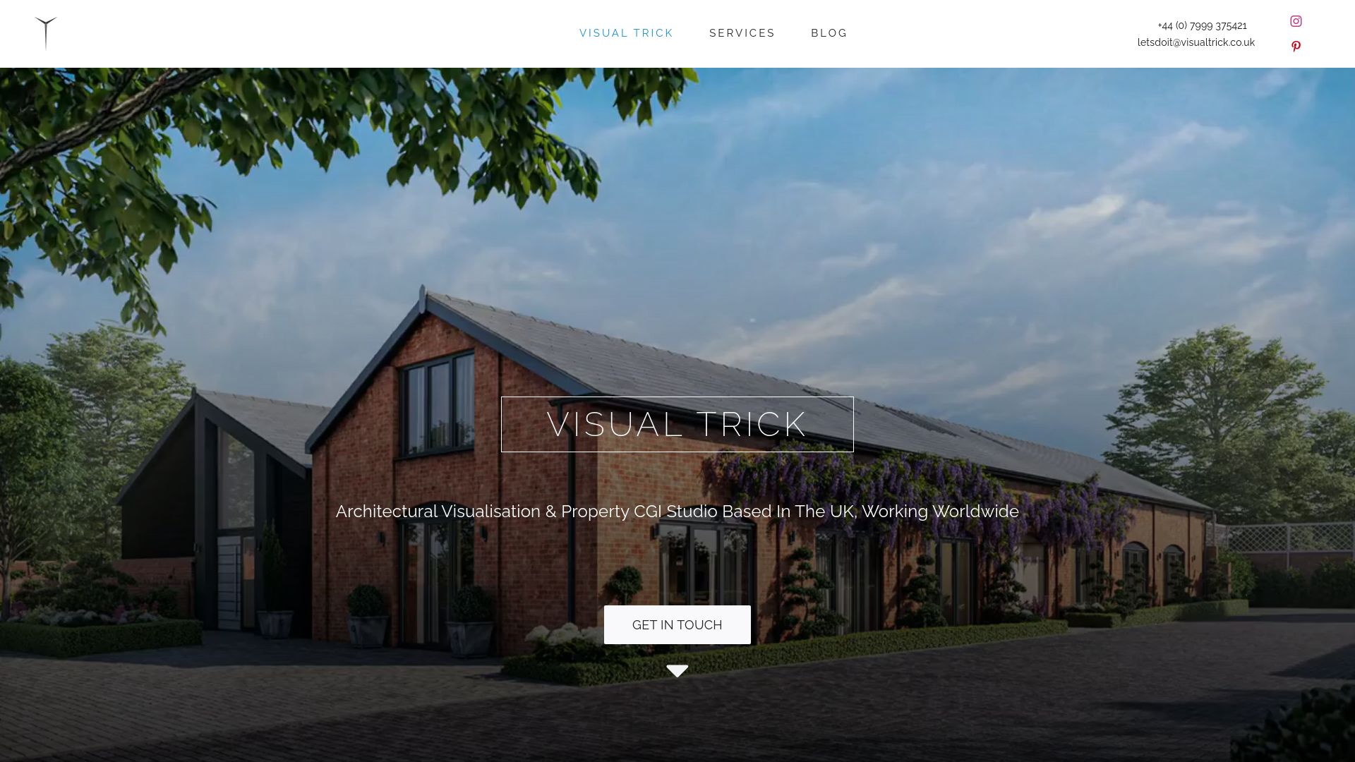
For planning-led work, our planning visuals cover photomontage and verified views, and you can see the full range on our services page.
FAQ
What aspect ratio should property photos be for Rightmove?
Guides commonly quote 3:2 at 1024 × 683 px for Rightmove. Because Zoopla guidance quotes 4:3, supply both crops. Check the portal’s own upload guidance before publishing, as specifications can change.
Can I use 16:9 images in a property listing?
You can upload them, but portals tend to crop the top and bottom or pad the frame, and a wide exterior can look inconsistent beside standard interiors. Keep 16:9 for website heroes and presentations, and use 3:2 or 4:3 for listings.
Does a higher resolution change the aspect ratio?
No. A 1920 × 1080 image and a 3840 × 2160 image are both 16:9. Resolution is how many pixels there are, and ratio is the shape those pixels make.
Should property images be landscape or portrait?
Landscape for portals and most websites. Portrait images leave blank space either side on landscape-designed portals. Portrait works for social posts and print layouts where it is planned from the start.
What is the best single ratio if I can only pick one?
Pick 3:2 for a master. It matches most camera output and web blog formats, and it crops cleanly to 4:3 or 16:9 when you keep the subject away from the edges.
Sources
- What is an Aspect Ratio? | PetaPixel
- What is a photo’s aspect ratio? | Tamron
- How to Calculate Image Aspect Ratio | Ratilio
- A Complete Guide to Standard Photo Sizes | Adobe
- Understanding Aspect Ratios in Photography | Adobe Express
- Aspect Ratios | Place Photography
- Rightmove & Zoopla: A Photographer’s Guide to Image Requirements
- Plan Aspect Ratios To Avoid Needing Multiple Image Sizes | Impact Media
- Website Image Size Guidelines for 2026 | Shopify UK
- How to Optimize Images for Better Website Performance
- Taking Photographs for Websites | Square Socket
- Aspect Ratio | Connect Media Group
- Image Cropper Guide | DevToys Web Pro
