
Material realism in CGI is the degree to which surfaces in a render behave like the real thing: brick that has a believable bond and mortar line, glass that reflects and transmits, timber with grain at the right scale, stone with mottled colour and relief. It is separate from photorealism. A render can be stylised and still have convincing materials, and a render can be glossy and still feel plastic because the surfaces are wrong. For property work, getting materials right is what lets planners, investors and buyers read the building as something that could actually be built.
TL;DR
- Material realism is about how surfaces respond to light, scale and viewing distance, not about adding more detail everywhere.
- Four properties do most of the work: base colour, roughness, surface relief and real-world scale. Metals add a fifth: metalness.
- Lighting decides whether any material reads as real, so review materials under the lighting they will be shown in.
- For planning, materials should match what the application describes in colour, type and name. Marketing images can be more atmospheric.
- A short review checklist (below) lets you judge a render before sign-off without being a 3D specialist.
Table of Contents
- What material realism actually means in architectural CGI
- Material realism versus photorealism
- What makes common building materials look convincing
- Why lighting decides whether materials work
- Scale: the quiet cause of most fake-looking surfaces
- Why materials matter in planning and for investors
- How to assess a render’s material realism
- Perspective: why we build materials from your specification
- Choosing the right level of realism for each use
- Common questions about briefing materials
- Working with Visual Trick on materials
- FAQ
- Sources
What material realism actually means in architectural CGI
In architectural visualisation, a material is not just a picture of a surface wrapped around a shape. It is a set of instructions telling the renderer how that surface behaves when light hits it. Does the light scatter or bounce cleanly? Is the surface rough or smooth? Does it have tiny ridges that catch highlights? Is it translucent?
Most modern render engines use physically based rendering, usually shortened to PBR. In PBR, albedo is the base colour, roughness controls how sharp or blurred reflections are, normal maps add fine surface detail, and a metallic map separates metals from non-metals. The practical benefit is consistency: a PBR material reacts sensibly whether the scene is lit by a low winter sun or an overcast sky, so the same brick looks like the same brick in every view.
Material realism is therefore a craft of restraint and accuracy. It means choosing the right values, then checking them against how the real product looks at the scale the viewer will see it.
Material realism versus photorealism
The two terms get mixed up, and the difference matters when you brief a project.
Photorealism is the overall impression that an image could be a photograph. It depends on camera behaviour, composition, lighting, atmosphere, entourage (people, cars, planting) and post-production, as well as materials.
Material realism is one ingredient: whether each surface is credible on its own terms.
A few consequences follow:
- Every photoreal image needs strong material realism, but strong material realism does not require a photographic look.
- An early-stage concept image can use simplified, lightly textured surfaces and still communicate massing and mood. The materials only need to be plausible, not final.
- A planning image or a sales brochure hero shot needs materials specified closely, because the viewer is making decisions from them.
Does every project need a photographic finish? No. A feasibility study for an investor, a 3D floor plan for a marketing suite and a verified view for a planning committee each ask for a different level of finish. The right question is what the viewer must be able to judge from the image, and what level of material detail supports that judgement.
What makes common building materials look convincing
Each material fails in its own typical way. Knowing the usual failure helps you review work.
Brick
Brick looks wrong when the units are the wrong size, the bond is unrealistic or the mortar is an afterthought. A convincing brick surface needs a plausible unit size, bond, mortar colour and joint profile. Two further tells: perfectly uniform colour across a whole elevation, and a texture that visibly repeats in a tiled pattern. Real brickwork varies from brick to brick and from panel to panel.

Timber
Wood needs correctly scaled grain and subtle variation in gloss. The most common mistake is grain that is too large or too small for the board width, which makes cladding look like a printed sticker. Weathered timber on an exterior should also differ from the protected timber in a porch soffit.
Glass
Glass requires transparency and reflection working together. Too much reflection and the interior disappears, so the building looks like a mirror box. Too little and the glazing looks like an empty hole or a flat blue panel. The right balance depends on the sky behind the camera and the light level inside, which is why glazing is one of the first things we check at the lighting stage.
Concrete and stone
Concrete needs high roughness, relief and mottled colour. Flat grey with no tonal variation is the giveaway. Natural stone adds bedding lines, edge variation and joints that match the proposed coursing.
Metals
Metal behaves differently because it is not tinted by diffuse colour in the same way. In PBR workflows, metalness is set to 1 and the base colour tints the reflections. Anodised aluminium window frames, zinc roofs and brushed steel balustrades all depend on getting this right, along with the roughness value that sets how crisp the reflection is.
| Material | Properties that sell it | Common giveaway |
|---|---|---|
| Brick | Unit size, bond, mortar colour, joint profile | Uniform colour, visible tiling |
| Timber | Grain scale, gloss variation | Oversized or stretched grain |
| Glass | Transparency plus reflection | Mirror box or empty hole |
| Concrete | High roughness, relief, mottled colour | Flat grey, no relief |
| Metal | Metalness, tinted reflection, roughness | Plastic-looking sheen |
Why lighting decides whether materials work
A perfect texture under poor lighting looks fake, and a modest texture under good lighting can look excellent. Lighting is the first pillar of a believable render because it gives viewers a reason to trust the scene. Light reveals relief, produces reflections and tells the eye how far away a surface is.
For exteriors, the sky matters as much as the building. Exterior scenes usually benefit from HDRI lighting with real sky luminance variation rather than neutral lighting that flattens the image. A flat, evenly lit scene removes the soft gradients across a facade that make brick and render look three-dimensional.
The principles are the same ones photographers use on a studio set, where lighting choices for believable imagery change how texture, gloss and edges read. In CGI we build that light digitally, then check each material under it.
Two practical points for UK projects:
- Match the weather to the purpose. A marketing image may suit a bright, low-sun evening. A planning image usually benefits from calmer, more neutral conditions that do not flatter or distort the materials.
- Check materials in more than one condition. A cladding board that looks right in full sun can look flat in overcast light. Reviewing two lighting set-ups quickly exposes a weak material.
Scale: the quiet cause of most fake-looking surfaces
Scale errors are easy to miss because each element looks fine alone. Common examples:
- Roof tiles that are too large, which makes the house look like a model.
- Brick courses that do not align with window heads and sills.
- Paving slabs of an impossible size.
- Timber boards that are too wide to be plausible.
The fix is to build materials at real-world dimensions from the manufacturer’s data wherever it is available, then check that openings and edges fall on sensible coursing. This is also where an architect’s input is most valuable: the exact brick, slate or cladding product named in the drawings should be the product in the render.
Why materials matter in planning and for investors
In a planning context, materials are not decoration. The standard application guidance for England asks applicants to describe the type, colour and name of materials for walls, roofs and other parts, and notes that more information can go in a design and access statement, a planning supporting statement, or drawings and plans. A visual that shows a different brick or roof colour from the one described creates a mismatch the case officer or a neighbour can spot.
For views placed in real photographs, the Landscape Institute’s guidance on visual representation of development proposals sets out visualisation types, including photomontage, and says visualisations should come with a technical methodology. The aim there is accuracy of position, scale and form, so the material finish should be handled with the same discipline: represented as specified, not improved for effect.
For investors and buyers, the logic is different but related. They are judging quality and likely value from the image. Materials that look cheap suggest a cheap building. Materials that look right, and that match what is eventually built, build confidence and avoid disappointment at completion.
If planning visuals are part of your project, our guides on the role of visuals in planning permission and what planning-grade visual documents are cover the wider requirements.

How to assess a render’s material realism
You do not need to open a 3D file to review materials. Work through this list on the draft image at full size.
- Compare against the specification. Is the brick, cladding, roof and glazing the one in the drawings and design statement? Ask for a material schedule alongside the image.
- Zoom in on a facade panel. Look for visible repeats, uniform colour and missing joints.
- Check edges. Real materials have thickness: reveals around windows, shadow lines under copings, depth at cladding joints. Razor-sharp, zero-thickness edges read as CGI.
- Look at the reflections. Glazing should reflect a believable sky and surroundings. Metal should show a sensible reflection, not a uniform shine.
- Check scale. Count brick courses, tiles and boards against the openings.
- Look for weathering that suits the project. New-build brick is clean. A heritage refurbishment needs aged surfaces. Neither should be dirty by default or sterile by default.
- Test it under the intended use. Print size, screen size and viewing distance change what detail is needed.
This list also shows how to improve a weak render: most fixes come down to better reference, correct scale, a revised roughness or relief value, or a change in lighting. Feeding precise product data into the brief at the start avoids most rounds of revision.
Perspective: why we build materials from your specification
Materials are where a visual either earns trust or loses it. We have seen a good composition undermined by a facade that looked like wallpaper, and we have seen a modest scheme come across well because every surface was right.
Our approach is to treat the material schedule as part of the brief, not an afterthought. Every image is produced in-house by a single, experienced operator, so the person who reads your specification is the person who builds the materials and checks them under the light. There is no hand-off to an outsourced team, which means fewer misunderstandings about which brick or which glazing system you meant.
We also adapt the finish to the purpose and the audience. A planning view needs restraint and fidelity to the proposed materials. A marketing hero image can carry more atmosphere. Choosing the right level of realism for each is part of the service, and it is how we keep deadlines predictable even when schedules are tight.
Paride
Choosing the right level of realism for each use
| Use | Material priority | Typical approach |
|---|---|---|
| Planning application | Fidelity to specified materials | Neutral lighting, restrained finish, materials matched to the application |
| Verified views | Accurate position, scale and form | Materials as specified, set in a real photograph |
| Marketing and brochures | Appeal and emotional pull | Atmospheric lighting, rich detail, styled entourage |
| Investor pitch | Clarity and credibility | Clean finish, clear massing, accurate key materials |
| Interior sales and staging | Warmth and tactility | Fabric, timber and stone detail, carefully balanced lighting |
| Early concept | Massing and mood | Simplified, plausible materials |
A single scheme often needs several of these. The same model can serve a planning view, a hero marketing image and an interior, provided the materials are defined once and reused consistently.
Common questions about briefing materials
What should I send with the brief? Drawings, elevations, the material schedule, product names or samples, and photographs of comparable finishes. If the application describes materials, send those descriptions too.
What about materials not yet chosen? Say so. We can show plausible placeholders and update once the specification is fixed, which is cheaper than redoing a finished image.
Should every surface be hyper-detailed? No. Detail belongs where the eye lands: the entrance, the main elevation, the interior focal point. Distant or secondary surfaces need to be credible, not exhaustive.
Working with Visual Trick on materials
We produce exterior CGI, interior CGI and CGI photomontage and verified views for developers, architects, planning consultants, estate agents and designers across the UK and worldwide. Each image is built from your material specification, checked under lighting that suits its purpose, and delivered with the clarity your audience needs.
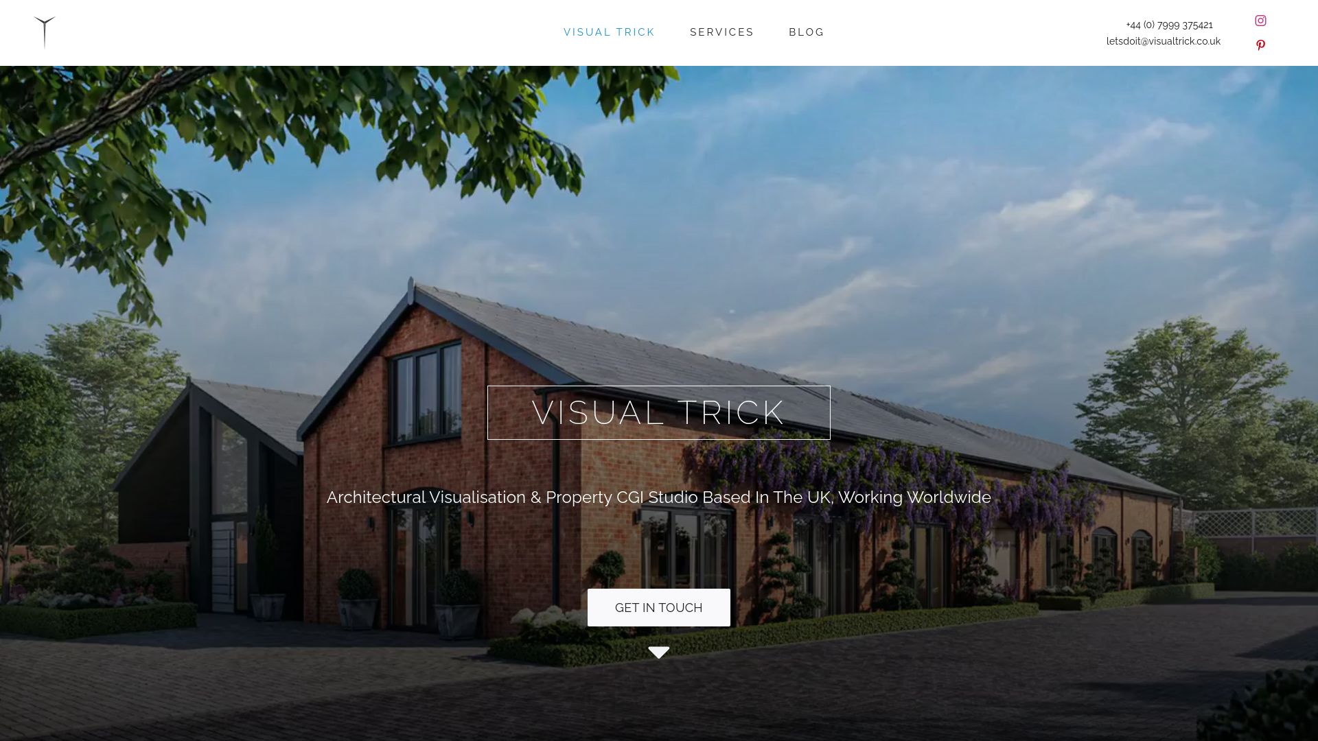
If you have a scheme coming up for planning or marketing, send us the drawings and the material schedule through our main site and we will talk through the right level of realism for each image.
FAQ
What is material realism in CGI?
It is how convincingly the surfaces in a render behave like real materials. That covers colour, roughness, relief, reflection, transparency and scale. A render has strong material realism when brick, timber, glass and stone each look like a specific, believable product.
Is material realism the same as photorealism?
No. Photorealism is the overall photographic impression, which also depends on camera, composition, atmosphere and post-production. Material realism is one part of it. You can have credible materials in a stylised image, but you cannot have a photoreal image without them.
Why do some CGI buildings look like plastic?
Usually because roughness and relief are missing, so every surface has the same smooth sheen, or because colour is perfectly uniform. Textures at the wrong scale and flat lighting make it worse. Adding surface variation and revising the lighting normally fixes it.
Do planners care about the materials shown in a visual?
Yes. Applications ask for the type, colour and name of materials, so a visual should agree with that description. A mismatch between image and application text invites questions, so the materials in the render should follow the specification.
How can I check material quality before approving a render?
Compare the image with your material schedule, zoom in on a facade panel for repeats and flat colour, check edge thickness and reflections, and count courses or boards against openings. The checklist in this article takes a few minutes.
Sources
- A Practical Guide to Mastering PBR Textures for Architectural Visualization
- Realistic Materials in AI Renders: Concrete, Timber, Glass
- Realistic Common Materials | Architectural Visualization
- Realistic 3D Rendering: A Production Guide for UK Studios
- 8 Key Architectural Visualization Tips
- Application for Planning Permission guidance, Planning Portal (England)
- Visual Representation of Development Proposals, Technical Guidance Note 06/19, Landscape Institute
