
Investor-grade architectural visuals do one job well: they let you test feasibility, marketability and design intent before a spade goes in the ground. They cannot prove financial viability, confirm ground conditions or replace due diligence, but a competent set of renders, photomontages and technical diagrams will tell you whether a scheme is coherent, sellable and ready for planning scrutiny.
- Risk reduction: visuals expose design conflicts, awkward circulation and unrealistic massing before capital commits.
- Clearer valuation signals: marketable interiors, natural light and context give you a proxy for how buyers or tenants will respond.
A rendering can show you what a building will look like. It cannot tell you whether the numbers behind it work. Treat visuals as a lens on design and marketability, never as a substitute for the financial model.
Key Takeaways
Investor-grade architectural visuals validate design intent and marketability, but only technical drawings and BIM exports confirm accuracy, so every render must be checked against its source plan before it enters a pitch deck.
| Point | Details |
|---|---|
| Visuals support, not prove | Renders show feasibility and marketability signals but cannot confirm financial viability or ground conditions. |
| Match output to audience | Use site context and massing for feasibility, interiors and animation for desirability, floorplans for operational checks. |
| Cross-check against drawings | Verify scale, elevations and window positions against the plan set before trusting any rendered image. |
| Sequence visuals deliberately | Lead investor decks with context and feasibility before polished interiors to avoid signalling aesthetics over fundamentals. |
| Brief for accuracy explicitly | State whether an image needs planning-grade verified photomontage or looser marketing interpretation. |
| Visual Trick delivers planning-ready assets | Visual Trick produces verified photomontage, BIM-compatible renders and VR walkthroughs built to survive investor and planning scrutiny. |
Table of Contents
- Why architectural visualisation matters for developers and capital partners
- What are the main types of architectural visual outputs?
- What are the stages of a standard ArchViz production workflow?
- Which software and rendering engines actually matter?
- How should investors read and critically evaluate visuals?
- How do you commission visuals: brief, deliverables, cost and timeline?
- Which trends are changing how investors commission and read visuals?
- How do you align visuals with the financial model?
- How do you assess design and compliance risk through visuals?
- How do you judge property value and marketability from visuals?
- How do technical drawings and rendered visuals work together?
- How do you brief suppliers so visuals match your investment strategy?
- What do successful investor decision-making examples look like?
- What are the common pitfalls and red flags in investor visuals?
- Publisher perspective: how Visual Trick approaches investor-ready visualisation
- How Visual Trick can help with your next investor pitch
- Frequently asked questions
- Sources
Why architectural visualisation matters for developers and capital partners
Developers commission visuals for five overlapping reasons: planning submissions, pre-sales and off-plan marketing, investor decks, lender packs and community consultation. Each audience reads the same image differently. A planning officer checks a photomontage against sightlines and massing; a buyer checks the kitchen light; an investor checks whether the scheme looks like it will sell at the assumed price point.
The commercial case is straightforward. Well-made visualisations communicate design intent clearly enough to function as planning-ready presentation material, which shortens the back-and-forth with planning authorities and reduces the number of resubmissions. On the sales side, layouts optimised for saleability, such as open-plan living, dual-aspect units and considered bathroom placement, can materially increase resale value and cut time to reservation. That is not a marketing claim, it is a design decision, and visuals are how you test it before construction locks it in.
Where visuals shift investor assessment:
- They reveal marketability signals: does the scheme look like something people will queue to buy, or does it look generic?
- They demonstrate brand positioning: does the imagery match the target buyer profile, or is it aimed at the wrong demographic entirely?
- They show operational readiness: are the communal areas, parking and servicing credible, or conspicuously absent from every image?
Heritage character and strong urban design also function as strategic economic assets that unlock measurable value or planning incentives, so a visual set that foregrounds those qualities is doing commercial work, not just decoration. If your visuals do not make that case, ask why.
What are the main types of architectural visual outputs?
Different stages of a project call for different assets, and using the wrong one wastes budget or, worse, misleads the audience it’s shown to. An investor deck at seed stage needs feasibility and context; a sales brochure needs desirability; a planning application needs technical rigour.
| Output type | Best for | Typical deliverable |
|---|---|---|
| Exterior stills | Marketability, brand positioning, planning committee packs | High-resolution JPEG/TIFF, multiple angles |
| Interior stills | Space perception, finish quality, buyer appeal | High-resolution JPEG/TIFF, dressed scenes |
| Verified photomontage | Planning submissions, sightline and scale verification | Georeferenced image with camera data |
| Cinematic animation | Investor pitches, sales launches, lender presentations | MP4/MOV, short duration typical |
| 360 VR / interactive walkthrough | Remote investor tours, off-plan sales suites | Web-based interactive build or headset file |
| AR previews | Site visits, show-home substitutes | Mobile app or web AR link |
| Floorplan visualisations | Space planning, unit comparison, rentable area checks | 2D/3D floorplan, PDF or interactive |
| Sections and axonometrics | Technical clarity, massing and levels | Vector or rendered diagram, PDF |
| Site context and massing | Early feasibility, planning context studies | Aerial or street-level composite |
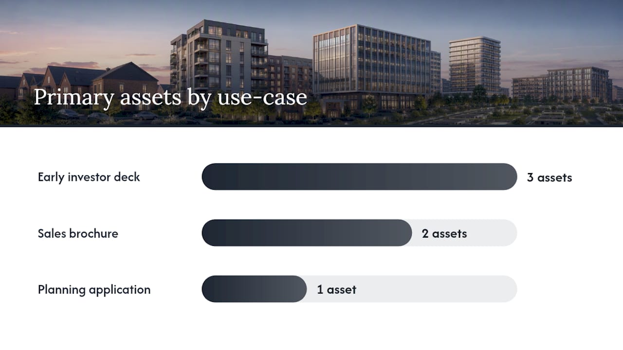
For an early investor deck, three assets do most of the work: a site context and massing image (feasibility), one strong exterior still (desirability), and a floorplan visualisation (operational credibility). A sales brochure leans harder on interior stills and a cinematic walkthrough. A planning application needs verified photomontage above almost everything else, since drawings and photomontages must correspond precisely to the underlying plans, elevations and sections that planning officers will cross-check.
What are the stages of a standard ArchViz production workflow?
Knowing the production sequence lets you judge whether a supplier’s timeline is realistic and where to insert your own checkpoints.
- Brief and objectives: the studio agrees scope, audience and level of technical accuracy with you before any modelling starts.
- Base 3D modelling (BIM import): the architectural model, often from Revit or ArchiCAD, is imported and checked for accuracy against the drawing set.
- Look development and materials: material libraries, textures and lighting rigs are built to match the design intent.
- Dressing, staging and entourage: furniture, landscaping, vehicles and people are added to bring scale and life to the scene.
- Lighting and camera passes: the studio sets sun angles, time of day and camera positions, usually offering two or three options for sign-off.
- Review and sign-off: you check the render against the brief, the drawings and (ideally) the financial assumptions behind the unit mix.
- Final output and post-production: colour grading, retouching and format conversion produce the deliverables you actually receive.
Expect a single exterior still to take one to two weeks from approved 3D model to final image; a full campaign with animation and VR can run four to eight weeks depending on scene complexity and the number of review rounds. The most common bottleneck isn’t rendering time, it’s late-stage design changes that force the model to be rebuilt after look development has already started. Lock the architectural model before commissioning visuals wherever possible, or budget contingency time for revisions.
At the review checkpoint, ask for:
- A side-by-side of the render against the relevant plan or elevation.
- Confirmation of which LOD (level of detail) the model was built to.
- A note on any assumptions made where drawings were incomplete.
Which software and rendering engines actually matter?
You do not need to operate these tools yourself, but recognising them helps you interrogate a supplier’s proposal and understand why one quote costs three times another.
Modelling and BIM platforms: Autodesk Revit and Graphisoft ArchiCAD are BIM platforms that produce coordinated models exporting structured data straight into visualisation pipelines, which matters because it keeps the render consistent with the architect’s live drawing set rather than a static snapshot. Autodesk 3ds Max and Blender are the workhorse general-purpose 3D packages many studios use for detailed scene-building and dressing.
Rendering engines: Photorealistic images are typically produced by exporting a model into an offline path-tracing renderer such as V-Ray or Corona, while real-time engines such as Unreal Engine and Twinmotion prioritise speed and interactivity over ultimate fidelity. Lumion and Enscape sit in a similar real-time category, favoured for rapid design reviews and walkthroughs where turnaround matters more than pixel-perfect lighting.
The practical trade-off: offline renderers (V-Ray, Corona) give you the crisp, magazine-quality stills used in brochures and investor decks. Real-time engines (Unreal Engine, Twinmotion, Lumion, Enscape) give you interactive walkthroughs and rapid iteration, useful for design reviews and remote investor tours, at a slight cost to ultimate photorealism. Many studios now run hybrid pipelines: model in Revit or ArchiCAD, dress and light in 3ds Max or Blender, then output both an offline still and a real-time interactive build from the same scene.
Insist on BIM-compatible exports (Revit, ArchiCAD or IFC format) and ask for source scene files, not just flattened images, if you expect to reuse assets across a campaign.
How should investors read and critically evaluate visuals?
A polished render tells you almost nothing about accuracy on its own. Run every image through a short checklist before it goes anywhere near an investor deck or a planning committee.
Quick checks:
- Is there a scale reference or scale bar, or at least a stated scale, on any technical image?
- Do shadows and sun position look consistent with a genuine solar study for that site and orientation?
- Does the render match the floorplan? Count doors, windows and room proportions against the plan.
- Is the context in a photomontage registered correctly against the actual photographic viewpoint?
- Is the image built to a working LOD, or is it a marketing-dressed concept masquerading as a technical reference?
Red flags worth pausing on: exaggerated or invented context (trees, parks or views that don’t exist on site), missing or inconsistent elevations, drawings marked “not to scale” being presented as if they were measured, and entourage or furniture placement that conveniently obscures a circulation problem or a cramped corridor.
Checking scale, door swings and cross-referencing plan against elevation catches most of these issues without needing technical training. If a drawing is marked “NTS”, don’t measure it. Ask for a measured drawing or a BIM export instead.
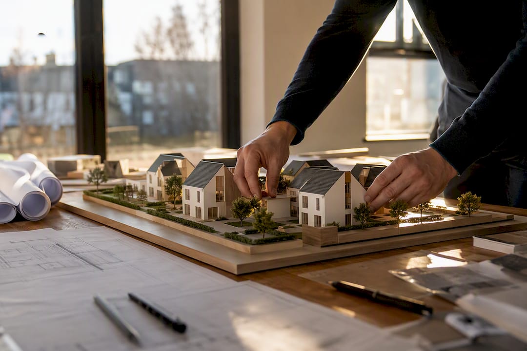
What to ask a supplier for as proof: the underlying model files, photomontage notes confirming camera position and lens data, a lighting study, a BIM export, and a plain-language note on assumptions (finish levels, furniture scale, planting maturity).
Pro Tip: Ask for one “undressed” render alongside the finished marketing image. If the studio can show you the base model with basic materials and no staging, you can judge the architecture on its own merits before the entourage does its persuasive work.
How do you commission visuals: brief, deliverables, cost and timeline?
A weak brief produces a scattergun set of images that satisfy nobody. A tight brief produces exactly the assets your audience needs, on schedule.
Briefing template to copy:
- Project summary: location, scheme type, unit count, target completion.
- Objective of the visuals: planning submission, investor deck, sales launch, or all three.
- Required outputs: match against the types table above.
- Target audience: planning officer, institutional investor, retail buyer.
- Required level of technical accuracy: marketing-led or planning-grade verified photomontage.
- Reference files supplied: BIM model, CAD drawings, site survey, photography.
- Budget band and deadline.
Deliverables checklist: final images at print and web resolution, animation specification (length, frame rate, format), source 3D files if you need reuse rights, and verified photomontage notes where planning accuracy is required. Confirm file formats up front, most studios deliver JPEG or TIFF stills, MP4 animations and either native scene files or FBX/OBJ for source assets.
| Output | Indicative cost band | Typical timeline |
|---|---|---|
| Single exterior still | Low to mid | 1-2 weeks |
| Interior scene | Low to mid | 1-2 weeks |
| Verified photomontage | Mid | 2-3 weeks |
| Cinematic animation (short duration) | Mid to high | 3-6 weeks |
| VR / interactive walkthrough | High | 4 weeks |
Scope drives price more than anything else: the number of camera angles, the complexity of landscaping and entourage, and the number of review rounds baked into the contract. A quote that looks unusually cheap for a VR walkthrough is worth interrogating, ask specifically how many review rounds are included and whether the underlying model needs to be rebuilt from scratch or reused from an existing BIM file. Visual Trick’s property architect visualisation checklist is a useful reference point when drafting your own brief.
Which trends are changing how investors commission and read visuals?
Four shifts are worth tracking if you brief visualisation work more than once a year.
- AI-assisted look development and upscaling: studios increasingly use AI tools to speed up texturing and image upscaling. Ask whether AI-assisted passes were used on any planning-critical image, since accuracy checks matter more when a step was automated.
- Real-time review in Unreal Engine and Twinmotion: design reviews now happen interactively rather than through static render rounds, cutting revision cycles and letting you walk a scheme before it’s built.
- Demand for planning-ready verified photomontages: planning authorities are increasingly strict about photomontage methodology, so ask for camera and lens data as standard, not as an extra.
- Interactive 360 assets for remote investor tours: institutional investors based overseas or across regions increasingly expect a 360 or VR asset rather than a static deck, particularly post-pandemic.
AI-assisted workflows and real-time review tend to reduce cost and turnaround. Verified photomontage and full VR builds improve fidelity and interactivity, but they cost more and take longer, so budget for them deliberately rather than as an afterthought.
How do you align visuals with the financial model?
The single biggest gap between good and mediocre investor visuals isn’t polish, it’s whether the image actually maps to a number in the appraisal. Investors value renderings that stay consistent with the financial model; a spectacular render that contradicts the operational assumptions behind it undermines credibility fast.
Build a simple mapping table before you commission anything: massing and unit count map to unit mix and yield, interior layouts map to rentable area, landscape and amenity map to the achievable rental or sale premium.
Three steps make this practical: first, share the appraisal’s key assumptions with the studio before look development starts. Second, request one review round specifically checking image against numbers, not just image against aesthetics. Third, sequence your deck so context and massing come before polished interiors, since leading with marketing visuals before feasibility signals to sophisticated investors that aesthetics are being prioritised over fundamentals.
Pro Tip: If a render shows a rooftop terrace, check whether the appraisal actually charges a premium for it. Visuals that promise amenity the numbers don’t monetise are a quiet red flag investors increasingly notice.
How do you assess design and compliance risk through visuals?
Visuals expose risk long before construction does, if you know where to look. Start with accessibility: check step-free access at entrances, lift positioning relative to unit clusters, and corridor widths in floorplan visualisations. A render that hides the main entrance behind landscaping or crops out the accessible route is worth a direct question to the design team.
Regulatory compliance shows up in subtler ways. Window-to-floor-area ratios affect daylight compliance in many jurisdictions, and a convincingly lit interior render can mask a room that would fail a genuine daylight assessment. Cross-check any interior scene claiming generous natural light against the floorplan’s actual window sizes and orientation.
Design flaws often hide in what’s missing rather than what’s shown. Bin storage, cycle storage, plant rooms and servicing access rarely feature in glossy exteriors, but their absence from every image in a set is itself informative, it usually means the design hasn’t resolved them yet. Ask to see a service or utility plan alongside the marketing set.
Fire escape routes, refuge areas and secondary means of escape are also commonly absent from investor-facing renders because they’re visually unglamorous. Their omission isn’t necessarily dishonest, but if a scheme has genuine circulation constraints, a supplier under pressure to make images “sell” may unconsciously choose camera angles that avoid the problem entirely. Ask for a section drawing through the core to settle any doubt.
How do you judge property value and marketability from visuals?
Space utilisation is the first thing to check, and it’s the easiest to misread from a hero shot. A wide-angle lens exaggerates room proportions, so cross-reference any interior still against the floorplan’s stated dimensions before assuming a bedroom is genuinely double-sized.
Natural light claims deserve scrutiny too. Layouts optimised for saleability, including dual-aspect units and considered room orientation, correlate with faster resale and stronger achieved prices. If a render shows a bright, sunlit living room, check the floorplan for the room’s actual compass orientation, a north-facing “sunlit” render is a common and easily missed inconsistency.
Aesthetic appeal matters commercially, but test it against the target buyer profile rather than your own taste. A scheme aimed at first-time buyers doesn’t need the same finish level as one aimed at institutional build-to-rent investors, and a supplier who dresses every scene identically regardless of audience probably hasn’t been briefed properly.
Finally, look at how communal and external areas are represented. Amenity spaces, courtyards and landscaping drive achievable premiums in many residential schemes, and a design that photographs well in these areas usually performs well commercially too, provided the images match what will actually be built rather than an aspirational upgrade.
How do technical drawings and rendered visuals work together?
Renders exist to interpret drawings, not replace them. A drawing set conventionally includes plans, elevations, sections and perspectives, and every rendered image should trace back to one of these documents. If a render shows a feature you can’t locate on the plan, that’s a discrepancy worth raising before it goes into a pitch deck.
The practical reading sequence works the same way whether you’re looking at raw drawings or checking a render against them: start with the title block and sheet index, then move through site plan, floor plans, elevations, sections, and finally details and schedules. Apply that same order when reviewing a visual set, site context first, then floorplans, then the polished stills, so you build understanding progressively rather than being led by whichever image looks most impressive first.
Sections and axonometric diagrams are chronically under-used by non-technical audiences, which is a mistake. A section drawing reveals floor-to-ceiling heights, level changes and structural depth that no exterior still will ever show. If a scheme has an unusual site with level changes, insist on seeing a section before judging the exterior renders.
Where a rendered image and a technical drawing genuinely conflict, always defer to the drawing. Renders are illustrative interpretations built for persuasion; drawings are the coordinated technical record everything else is checked against, including at planning stage.
How do you brief suppliers so visuals match your investment strategy?
The brief is where most misalignment starts, not in the studio’s execution. Investors and developers who get strong results treat the brief as a strategy document, not a shopping list.
Start by naming the audience for each asset explicitly rather than assuming one image set serves everyone. A lender pack, a retail sales brochure and an institutional investor deck have different tolerances for polish versus technical rigour, and briefing them identically wastes budget on assets nobody uses.
State your financial assumptions as part of the brief, not as background context the studio has to infer. If your appraisal assumes premium finishes justify a specific price uplift, say so, so the look development stage reflects that assumption rather than a generic default finish level.
Specify accuracy tolerance explicitly: tell the studio whether an image needs to be planning-grade verified photomontage or a looser marketing interpretation. Conflating the two, or leaving it unstated, is the single most common cause of expensive rework late in a project.
Finally, build in a mid-project checkpoint tied to your own investment milestones, not just the studio’s production schedule, so visuals are ready when your fundraising or planning timeline actually needs them, not simply when the render is finished.
What do successful investor decision-making examples look like?
The pattern across schemes that use visuals well is sequencing, not budget. Sequencing visuals to mirror how investors actually assess risk, starting with site context and massing to establish feasibility, then marketability through exterior and interior character, then technical floorplans to demonstrate operational efficiency, consistently produces stronger investor engagement than leading with the most dramatic hero shot.
A joint venture proposal, for instance, benefits from opening with a massing study that visibly respects the site’s constraints before moving to character imagery, because JV partners are typically assessing feasibility risk before they care about finish quality. The same logic applies to off-plan sales campaigns, where visualisation assets mapped deliberately to each stage of the reservation journey tend to convert enquiries into reservations more reliably than a single undifferentiated image set used throughout.
Pitch deck structure matters here too. Tools built specifically for investor deck construction and narrative flow reinforce the same principle that applies to visuals: the order information appears in changes how it’s judged, regardless of how good any single slide or image is on its own.
What are the common pitfalls and red flags in investor visuals?
Watch for context inflation first, mature trees, invented parkland, or skylines that don’t match the actual site photography. It’s the easiest manipulation to spot once you know to look for it, and one of the most common.
Inconsistent elevations are a close second. If the number of storeys, window positions or roofline in a rendered exterior doesn’t match the elevation drawing for the same facade, someone hasn’t updated one document after a design change, and you need to know which version is current before relying on either.
Watch for drawings marked “not to scale” being presented, deliberately or carelessly, as if they carried measured accuracy. Never estimate dimensions from an NTS drawing; request the measured version or a BIM export instead.
Entourage overuse is subtler but common: furniture, planting and staged photography angles chosen specifically to obscure a narrow corridor, an awkward bathroom layout, or a cramped communal area. If every image in a set uses a camera angle that conveniently avoids a particular part of the floorplan, ask why.
Finally, be wary of a visual set that looks expensive and polished but arrives with no supporting technical files, no BIM export, no photomontage notes, no explanation of assumptions. Polish without provenance is the clearest signal that a scheme is being sold on image rather than substance.
Publisher perspective: how Visual Trick approaches investor-ready visualisation
Visualisation only earns its place in an investor pack when it can survive scrutiny, not just admiration. Every planning-ready photomontage Visual Trick produces is built to be checked, camera position, lens data and context registration included, because an image that can’t withstand a planning officer’s cross-reference isn’t doing its job for a developer either.
Proof matters more than polish in this line of work. Case studies, planning examples and a portfolio built on schemes that actually secured consent carry more weight than any single hero render, however striking.
If you’re preparing a brief for your next scheme, the property architect visualisation checklist is a practical place to start before requesting a quote.
How Visual Trick can help with your next investor pitch
There are other ways to get investor visuals made, from freelance 3D artists to large agencies bundling visualisation into a wider marketing retainer. Visual Trick’s advantage is narrower and more useful for this specific job: planning-ready verified photomontage, BIM-compatible workflows, and a portfolio built specifically around developer and investor decision-making, rather than generic property marketing.
Visual Trick produces architectural visualisation across the full asset range covered in this guide, exterior and interior stills, verified photomontage for planning, cinematic animation for investor decks, and VR walkthroughs for remote investor tours. Sector-specific work for care operators and retirement developers draws on the same accuracy standards, matched to models supplied by architects working in Revit or ArchiCAD.
For a fast, accurate quote, send your site plan, elevations or BIM export, a note on target audience, and your required output list against the brief template above. Get in touch through the architectural visualisation services page to request a briefing review and a quote tailored to your scheme.
Frequently asked questions
What is the difference between a render and a verified photomontage?
A render is an illustrative 3D image built for marketing or design communication. A verified photomontage is built to a documented methodology, matching camera position, lens data and site photography, so a planning authority can check it for accuracy rather than treat it as an artist’s impression.
How much should I budget for an investor deck’s visuals?
Cost depends heavily on scope: the number of camera angles, whether photomontage verification is required, and whether animation or VR is included. A single exterior still sits at the low end of the cost scale; a full campaign with animation and an interactive walkthrough sits considerably higher, driven mainly by review rounds and scene complexity rather than resolution alone.
Can I trust a rendering that looks photorealistic?
Photorealism is a rendering quality, not an accuracy guarantee. A beautifully lit image built from an outdated or NTS drawing is still wrong. Always cross-check the underlying model or drawing set, not just how convincing the final image looks.
What should I ask for if a supplier’s proposal seems too cheap?
Ask specifically how many review rounds are included, whether the 3D model is being built from scratch or imported from an existing BIM file, and whether photomontage verification is included or charged separately. Unusually low quotes often mean one of these has been quietly stripped out.
Do I need BIM files, or are rendered images enough?
For planning submissions and any scheme with structural complexity, insist on BIM compatibility (Revit, ArchiCAD or IFC exports) alongside the final images. Flattened images alone can’t be cross-checked or updated efficiently if the design changes.
Sources
These resources are practical references for developing your own reading and briefing skills, not a directory of suppliers.
- Understanding architectural drawings
- What is architectural visualization? A complete guide
- Reading Blueprints: How to Read Plans Like a Pro
