
In an architecture or built-environment competition, your visuals are the entry. A jury reads dozens of submissions, so the images decide who gets a second look. The strongest entries use one or two hero images to carry the idea, supporting drawings that prove it works, and short captions that never make the reader guess. This guide covers what briefs ask for, how to pick and order your images, and where entries most often go wrong.
TL;DR
- Read the brief first: format, board order, scale, anonymity and site boundary rules can disqualify an entry before anyone looks at the design.
- Lead with one or two dramatic images, then add smaller views at contrasting scales to show the detail.
- Choose images that tell the story of the scheme’s strengths. Information beats decoration.
- Keep captions short, readable and spell-checked, and label what is built, what is visualised and what is proposed.
- Plan the visuals against the judging criteria, not against what is easiest to render.
Table of Contents
- What “visuals” means in a design competition
- What briefs usually ask for
- Read the rules before you open the modelling software
- Choosing images that make the argument
- Render, sketch or photomontage?
- Captions, text and the non-specialist reader
- Common mistakes that weaken an entry
- A practical production timeline
- Our perspective
- Need visuals for your next entry?
- FAQ
- Sources
What “visuals” means in a design competition
The word covers more than a pretty render. In built-environment competitions, visuals are the whole visual argument: plans, sections, elevations, diagrams, photographs of context or models, and rendered perspectives. Research on architectural competitions shows that design visualisations circulate between architects, clients and juries, changing the design and raising new questions as they go. In other words, the image is not an afterthought. It is part of how the idea gets developed and judged.
There is also a stylistic shift worth knowing about. Academic work on competition imagery describes an “affective logic”, where images are staged through composition and cinematic expression to amplify the experience of a future space rather than only depict a building. That is why light, people, weather and viewpoint matter so much in a hero image. It is also why the pressure to polish can tip into style over substance, which juries notice.
Built environment versus graphic design contests
The search term “design competitions visuals” pulls in two quite different worlds. Graphic, branding and product awards judge finished artefacts: a logo system, a book, a poster. The visual is the work itself, and entry rules usually focus on image resolution, file type and category.
Architecture and landscape competitions judge proposals for something that does not exist yet. The visuals therefore have to do three jobs at once: show what it looks like, explain how it works, and persuade a panel that it can be built on the given site. The rest of this guide is about that second world, because it is where the choice of visual makes or breaks an entry.

What briefs usually ask for
Briefs differ, but the pattern is consistent. The Royal Architectural Institute of Canada’s guidance lists the typical submission items as site plans, floor plans, elevations, sections, perspectives or digital pass-throughs, and information on key design features such as sustainability.
UK examples show how tightly some briefs control the format:
| Brief | Visual requirement |
|---|---|
| RSAW Design Week competition | A single A2 board using drawings, diagrams, photographs, visualisations and supporting text |
| Home of 2030, Phase 2 | Four A1 design boards plus a separate design report of up to 20 single sides of A4 |
The lesson is not the numbers. It is that the container is fixed and your job is to spend its space wisely. A single A2 board cannot hold six renders, so something has to lead and the rest has to support.
Not every body wants maximum detail either. The Romanian architects’ order’s best practice guide recommends adapting required sheets and scales to the conceptual needs of the competition and avoiding excessive or overly detailed requirements. If you run or write a brief, that is a useful principle. If you enter one, it tells you that concept clarity usually outranks technical completeness at the early stage.
Read the rules before you open the modelling software
The RIBA’s competition entry guidance is blunt about the basics: check the deadline, requested format, anonymity rules, board order, orientation and scale constraints, and note that leaving out a key constraint such as the site boundary can lead to disqualification. Build a one-page checklist before any design work starts.
- Deadline and time zone. Work back from it, leaving time for rendering, which is rarely quick on a complex scene.
- Format and size. Orientation, board count, page limits, file type, file size and resolution.
- Anonymity. Strip names, logos, file metadata and any signature style that would identify your practice.
- Mandatory content. Site boundary, scale bars, north point, specified drawings and any required statement.
- Scoring. Which criteria carry weight? Sustainability, buildability, context, community value?
- Layout constraints. Board order, numbering and whether text and images may overlap.
Pin the list beside your screen. Most avoidable failures happen here, long before the quality of a render matters.
Choosing images that make the argument
The RIBA advises entrants to tailor responses to the project’s aspirations and evaluation criteria, and to choose relevant, clear, good-quality images that show the project’s strengths. Treat the entry like a job application: every image should answer something the panel is asking.
Start from the judging criteria
List each criterion and ask which single image proves it. If a criterion is community value, a populated street-level view says more than an aerial of an empty roof. If it is sustainability, a section with annotated environmental strategy beats a glossy exterior. If it is fit with context, a view that includes neighbouring buildings or a verified photomontage from a known viewpoint carries weight that a floating model cannot.

Build a hierarchy
An Architects’ Journal guide to competition and awards entries recommends using one or two key images for dramatic effect, smaller images at contrasting scales, and concise, comprehensible, spell-checked text with readable captions. A workable structure on one board looks like this:
- Hero image (about a third of the board). The view that sells the idea: eye level, strong light, a clear focal point.
- Context or aerial view. Shows how the scheme sits in its surroundings.
- Two or three explanatory views. A key interior, an entrance, a courtyard, each tied to a criterion.
- Diagrams. Circulation, structure, environmental strategy, phasing. Keep them graphic and legible at arm’s length.
- Plans and sections. At a scale the brief supports, with scale bars.
The same guide makes a useful point on photography: for awards, prioritise information over art. The same logic holds for renders. A dramatic sunset that hides the façade material does less than a clear daylight view that shows it.
Be honest about what each image is
The RIBA also tells entrants to distinguish built projects, visualisations of ongoing projects and competition submissions. Label a render as a render. If you show a precedent or a completed building to demonstrate capability, caption it clearly so the panel is never unsure what it is looking at.
Render, sketch or photomontage?
The right visual depends on the competition stage and what the jury needs to believe.
| Visual type | Best for | Watch out for |
|---|---|---|
| Photorealistic exterior render | Hero image, massing, materials, atmosphere | Over-polish that hides weak planning logic |
| Interior render | Experience, light, use of space | Too many furniture details distracting from the architecture |
| Concept diagram or sketch | Early stage ideas, strategy | Illegible linework at board scale |
| Photomontage in a real view | Fit with context, height and massing | Viewpoints that flatter the scheme unrealistically |
| Aerial view | Site layout, landscape, connections | Empty, lifeless surroundings |
| Short animation or walk-through | Final stages where media is allowed | Ignoring file size and format limits |
For early-stage ideas competitions, a restrained image language with a clear idea often wins over high realism. For shortlisted or delivery-focused stages, realism helps the panel judge buildability, materials and the experience of arrival. Our own guide to why architects use 3D visualisation goes deeper on matching the type of image to the decision it supports.
Captions, text and the non-specialist reader
Many jury members are not architects. They may be clients, councillors, community representatives or funders. Short captions that name the view, the time of day and what to notice save them from guessing. Keep sentences plain, avoid jargon where a simple word works, and spell-check everything, because typos on a competition board look careless.
If your scheme includes landscape, planting information needs the same clarity. A tool such as curated planting palettes lets landscape designers filter plants by site conditions, light and water needs and share palette sheets with essential details, which gives a non-specialist panel readable text to sit beside the visual rather than a Latin plant list. Our note on accurate planting visuals and client approval covers how the picture and the planting spec should agree.
Common mistakes that weaken an entry
The RIBA’s guidance points to a short list of faults: omitting key constraints such as the site boundary, failing to distinguish built projects from visualisations and competition entries, and using irrelevant, unclear or poor-quality images. In practice we would add a few that come from the production side:
- Too many hero images. If five views shout equally, none lands.
- Late rendering. Starting visuals in the last week leaves no time to fix a camera angle that does not work.
- Inconsistent style. Mixed lighting, mismatched people scale or different colour treatments make a board look assembled, not designed.
- Unreadable at a distance. Test your board at thumbnail size and at print size. If the idea is lost in either, simplify.
- Ignoring the brief’s tone. A community-led brief wants people and street life. A technical brief wants sections and strategy.
- Over-detail. Early-stage concept competitions rarely reward construction-level information.
A practical production timeline
Work backwards from the deadline and give visuals their own milestones:
- Brief analysis and checklist. One day, done by the whole team.
- Concept lock. Agree the one idea each image must communicate.
- Camera and view selection. Choose viewpoints on the massing model before any texturing.
- Draft renders. Check composition, scale and light early.
- Layout and text. Build the board with real images, not placeholders.
- Final render and proof. Print a proof at actual size where the brief allows.
- Submission check. Re-read the brief against the final files: format, size, anonymity.
Building in a buffer for the unexpected is cheaper than rushing a final render.
Our perspective
We see competition visuals from the production side, and the pattern is consistent: entries lose ground when the image tries to do everything. A good competition render has one job, to make a jury member understand the idea in a few seconds and want to read the rest.
That is why we work in-house with a single experienced operator rather than passing files between teams. You speak directly to the person building your scene, so changes to camera, light or materials are quick, deadlines stay predictable, and the workflow is adapted to the purpose and audience of the image, whether that is a jury, a planning officer or an investor.
Our advice is to brief the visual before the model is finished. Decide the hero view, the two supporting views and what each must prove. Then spend the rendering time where the jury will look. Our planning and marketing work, including verified views and photomontage, comes from the same discipline: accuracy first, atmosphere second, and nothing that the drawings cannot back up.
Paride
Need visuals for your next entry?
If you are preparing a competition board, a shortlist presentation or a planning-stage submission, we produce photorealistic exterior and interior CGI, aerial views and verified photomontage to the purpose and audience of each image. Start with our architectural visualisation services, or look at exterior CGI and interior CGI if you already know which hero view you need.
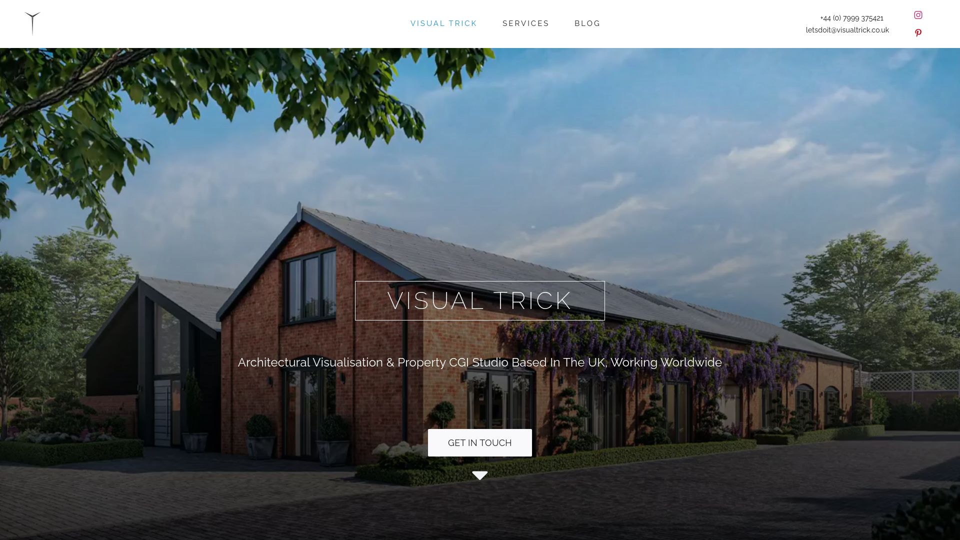
Send us the brief, the deadline and the board format, and we will tell you what is achievable in the time. For projects that continue beyond the competition, our planning visuals use the same scene for photomontage and verified views, and our guide to the role of visuals in planning permission explains how competition imagery carries forward.
FAQ
How many images should a competition board contain?
There is no fixed number, because the brief sets the format. A sound approach is one or two dominant images, a handful of smaller supporting views at different scales, and the required plans and sections. If the board looks crowded at thumbnail size, remove an image rather than shrink them all.
Should competition visuals be photorealistic?
It depends on the stage and the brief. Early ideas competitions often reward a clear concept and a consistent image style over high realism. Later stages, where buildability, materials and experience matter, benefit from realistic views that show how the scheme would look and feel.
Can a competition entry use built-project photographs?
Only where the brief allows it, and always labelled. RIBA guidance asks entrants to distinguish built projects, visualisations of ongoing projects and competition submissions, so a reader never mistakes a precedent for the proposal.
What file details should I check before submitting?
Check the deadline, format, file size, resolution, board order, orientation, scale requirements and anonymity rules. Remove names and metadata from files if entries are judged anonymously, and confirm that mandatory items such as the site boundary appear.
When should I commission a visualisation studio?
Before the design is final. Bringing a visualisation specialist in once the massing is settled lets you choose views, test light and plan the board together, rather than asking for a rescue render in the last days.
Sources
- Design as redesign in the case of architectural competitions (University of Reading)
- Affective logic of competition images (Visual Studies, 2018)
- Competition Brief (RAIC)
- RSAW Design Week Competition (RIBA)
- Home of 2030 Competition Brief, Phase 2 (BRE)
- Design Competitions Best Practice Guide (OAR)
- Competition entry guidelines (RIBA)
- How to design a successful awards or competition entry (Architects’ Journal)
- GreenCurate planting palettes
