
Lighting decides whether an interior render looks like a photograph or like a model. Get the daylight right first, add artificial light in layers that serve a purpose, keep colour temperature consistent with the story you are telling, and fix problems with exposure before you add more lamps. That order produces rooms that feel lived in, and it is the order we work in at Visual Trick.
This guide is for developers, architects, interior designers and agents who commission or review interior visuals. It explains what good lighting looks like, how it is built, and what to ask for in a brief.
TL;DR
- Decide the time of day and the mood before anything else, then light the room to match.
- Treat windows as the main source and artificial fittings as secondary, so the brightness ratios feel natural.
- Build artificial light in layers: structural, ambient and decorative, each with a job.
- Judge colour temperature from the final camera view, not from a single lamp in isolation.
- Correct flat or blown-out images by adjusting exposure and bounce first, not by hiding extra lights in the scene.
Table of Contents
- What lighting actually does in an interior render
- Start with daylight: plan the scene before you place a light
- Layer the artificial light
- Choosing colour temperature
- Settings that make interior light behave
- Fixing flat, dark and blown-out interiors
- A quick checklist for reviewing an interior render
- Borrow from photography
- Our perspective
- Interior visuals from Visual Trick
- FAQ
- Sources
What lighting actually does in an interior render
Light tells the viewer what the room is for. It sets the time of day, shows where to look, and gives materials their depth. A beautifully modelled kitchen with flat, even light reads as a diagram. The same kitchen with a bright window, a soft falloff across the worktop and a glow over the table reads as somewhere you could stand.
Visualiser Naim Munivez Lara puts the aim well in a V-Ray and 3ds Max breakdown for The Rookies: the task is less about lighting a space than about deciding what people should feel inside it. He builds a hierarchy of intensity, with focal points receiving stronger light and visual rest areas left in shadow, which creates depth.
That hierarchy is the practical idea to take away. A room where everything is equally bright has no focal point. A room where the sofa, the dining table or the entrance is clearly the brightest area guides the eye without any text on the image.
For buyers and tenants who never visit the site, the render is the only evidence of how the space will feel. That is why lighting is not a finishing touch for us. It is part of the design intent, agreed before the first test image. If you are weighing up why a specialist is worth commissioning at all, our piece on why use 3D interior rendering services covers the wider case.
Start with daylight: plan the scene before you place a light
The most common mistake is to open a scene and start dropping lights in. Experienced lighting artists work the other way round. Ricardo Eloy, writing on the Chaos blog, advises deciding how the design should look and choosing a time of day first, then analysing the scene and ranking light sources by importance. A large window is a natural first source because it fills the room with soft ambient light.
Orientation, openings and time of day
Three questions shape every interior before a single fitting is added:
- Which way does the room face? A north-facing living room in the UK gives cool, even light. A south-facing one gives strong, directional sun with hard shadows at certain hours.
- How big are the openings? Window size and position control how deep the light travels and how bright the glass looks against the walls.
- What is outside? Neighbouring buildings, trees and the sky all change the colour and quantity of light entering.
VizAcademy makes the same point in its guide to natural and artificial lighting in 3D interiors: orientation, nearby buildings and window size all influence the light from sun and sky, while artificial lighting is the finishing touch that can also be decorative.
For UK schemes there is a professional reference behind this. CIBSE’s Lighting Guide 10 on daylighting was written primarily for buildings in the UK. It covers orientation, siting, massing, shading, glazing and daylight calculations, and includes a section on computer-based visualisation in the design process. CIBSE’s newer LG23 on design, creativity and compliance is aimed at lighting designers, architects and interior designers, and addresses visual perception, comfort and daylight. Neither is a rendering manual, but both explain the real-world conditions a convincing render should respect.
Sky and sun settings
D5 Render’s interior lighting webinar guide suggests starting with an HDRI that has no sun, which lets you place important elements and frame the subject, then refining the lighting story to guide the eye. It also recommends switching off the artificial lights first. Seeing only the outdoor contribution tells you why a room looks flat, overexposed or disconnected from its windows. When a project needs a credible relationship between orientation, openings and the sun’s path, a geographically based sky is the better choice than a generic one.
In practice this means a developer’s brief should state the intended time of day for each hero view. Late afternoon for a family kitchen, early evening for a penthouse living room, bright mid-morning for a care home lounge: each is a lighting decision, not a post-production filter.
Layer the artificial light
Once daylight is established, artificial light adds warmth, emphasis and a sense of use. The principle is restraint. Ricardo Eloy’s advice is not to switch on every light but to use artificial light to paint the scene with light, dark and colour, for example balancing the blue of window light with the warm glow of a floor lamp.
Ambient, task and accent in a render
The lighting layers used in real interiors translate directly into render work:
| Layer | Job in the image | Typical render source |
|---|---|---|
| Ambient | Overall, even, structural light | Recessed downlights, ceiling fittings, bounced daylight |
| Task | Light where activity happens | Under-cabinet strips, reading lamps, pendants over a worktop |
| Accent | Focal points and texture | Wall washers, picture lights, shelf LEDs, decorative lamps |
The Rookies breakdown gives a concrete example of three artificial layers in a bedroom scene. Technical downlights at 3500K provided neutral structural light. Indirect LED strip lighting at 2700K created a warm, cosy atmosphere. Decorative bedside lamps at 2700K, driven by IES profiles, acted as focal points, and exterior wall lights at 3000K kept the outside visually consistent with the inside. Each layer has a different purpose, and none of them tries to do everything.
Real fixtures, real distributions
IES profiles are manufacturer light-distribution files. They let a lamp in a render throw light in the same pattern as the actual fitting: a narrow beam from a spotlight, a wide wash from a wall light. When the fittings in a scheme are known, using their profiles makes the pools of light on walls and floors believable, and it helps the render match what contractors will install.
Keep the ratios honest
If a lamp in a daytime scene appears brighter than the window, the eye reads it as wrong. Windows should usually be the brightest elements in a daytime view, with artificial fittings contributing secondary light. At night the relationship flips and the fittings carry the room, but they still need falloff: bright near the source, softer further away.
Choosing colour temperature
Colour temperature, measured in kelvin, is the quickest way to set mood. Lower values look warm and amber, higher values look cool and white. The Rookies example above shows a practical range for a residential bedroom: 2700K for the cosy layers, 3000K for exterior wall lights and 3500K for neutral technical lighting.

The key is consistency of intent, not uniformity. D5 Render notes that a credible interior does not need every source to share one colour: daylight can stay cooler while fittings warm the materials and living areas. It also stresses judging temperature from the final camera, because a value that looks right on its own can become excessive once exposure, white balance, materials and the exterior view interact.
A few working habits follow from that:
- Pick a warm family for homes. Residential schemes generally sit in the warmer range, with the cooler daylight acting as contrast.
- Use neutral light where the brief is clean and functional. Kitchens, workspaces and clinical or care environments often call for crisper, more neutral light, matched to the specified fittings.
- Do not mix at random. Two warm lamps at visibly different temperatures look like an error unless one is clearly a different type of fitting.
- Review at full view. Check the image on a calibrated screen, not as a thumbnail.
For developers working with a lighting designer, the best brief is simply the fitting schedule. If the scheme specifies 2700K pendants and 3000K downlights, the render should show exactly that.
Settings that make interior light behave
Realism depends on the renderer simulating how light really moves. Lumion recommends ray tracing in interior scenes because it simulates sunlight bouncing off surfaces, realistic reflections in shiny materials and proper shadows.
The underlying principle is global illumination. In Jeremy Birn’s Digital Lighting and Rendering, indoor light is described as a mix of natural light through windows, doors and skylights plus practical artificial lights. Switching on global illumination lets the colour and brightness of each surface help illuminate other surfaces, giving naturalistic results without extra lights faking the indirect light.
This has a consequence for material choices. A cream wall bounces warm, soft light into the room. A deep green wall absorbs it and tints it. If the render’s lighting looks off, it is often the surfaces rather than the lamps that need attention.

Fixing flat, dark and blown-out interiors
Most lighting problems fall into a few patterns, and nearly all have a fix that does not involve adding more lights.
Overexposed windows and walls
The Poliigon blog on common interior lighting mistakes recommends adjusting exposure first, as a photographer would, rather than trying to light everything. It also notes that blown-out highlights on simple surfaces such as walls can be used deliberately for artistic effect. Paweł Pęcherzewski adds that where there is light there must be shadow, and that clients often ask for every lamp to shine as brightly as the sun. The better answer is to add light in the most natural way, by adjusting bounce rather than adding hidden lamps.
Sun strength and mood
Lumion’s guidance is useful here: reducing the sun’s brightness gives muted colours and soft, cool lighting, while increasing it makes the scene warmer, brighter and cosier. Lowering the sun and sky also makes artificial lighting look brighter, which is the quickest way to make an evening scene glow.
Flat light
Flat images usually come from one of three causes: the artificial lights are doing too much, the surfaces are all the same value, or there is no clear hierarchy of brightness. Return to the focal-point idea. Pick the area that matters, let it be brightest, and let the rest fall off.
What not to do
Two shortcuts reliably make renders worse. Removing walls or ceilings out of frame to let more light in changes how light bounces. Scattering invisible lights around the room flattens the result. Build the room as it will be, raise exposure, and correct contrast.
A quick checklist for reviewing an interior render
When a draft arrives, these questions find most problems in a couple of minutes:
- Can you tell the time of day within a second?
- Is there one clear focal area, and is it the right one?
- Are the windows believable, with a view and frame depth, rather than white rectangles?
- Do the fittings match the specification in colour and style?
- Are there soft shadows and gradual falloff, with some areas allowed to be dim?
- Does the colour feel intentional rather than accidental?
If the answer to any is no, send the note in those terms. “Make it brighter” is a weak instruction. “Lower the exposure so the window holds a view, and let the dining pendant be the brightest point” is one a visualiser can act on.
Borrow from photography
Believable render lighting is photographic lighting. The same principles that govern how a real room is photographed, such as where the windows are, how bounce fills the shadows and how the time of day changes colour, apply to a rendered one. For a useful look at how real spaces are shaped for the camera, see this piece on venue choice and photography, which shows how a room’s layout and light sources affect the final picture.
Our perspective
We light every interior as if we were photographing the finished building. Before we touch a lamp, we agree the time of day, the hero view and the feeling the room needs to give a buyer, tenant or planning officer.
Because all our imagery is produced in-house by one experienced operator, the person who reads your brief is the person who sets the light. There is no hand-off between a sales contact, a modeller and an outsourced lighting team, so the intent you describe is the intent that appears on screen, and deadlines stay predictable.
We also adapt the lighting to purpose. A planning image needs calm, accurate daylight. A marketing image can lean warmer and more atmospheric. A care home visual should feel bright, welcoming and uncluttered. Same room, different job, different light.
Paride
Interior visuals from Visual Trick
We produce custom interior CGI for developers, architects, interior designers, estate agents and property marketers, with lighting planned around the purpose of each image. Our interior CGI service covers marketing and design-stage views, and interior designers can see how we work in CGI for interior designers.
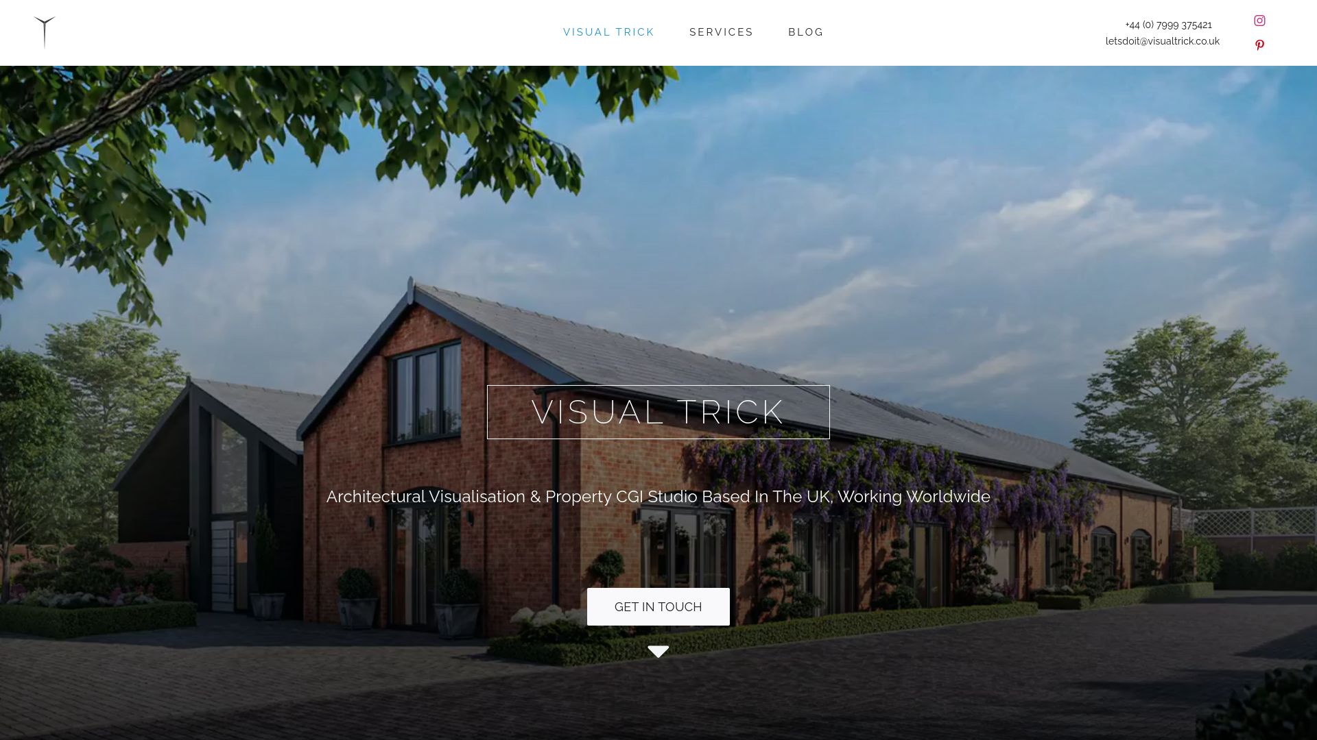
Send us your plans, fitting schedule and intended audience, and we will propose the lighting approach for each view. You can see everything we offer on our services page. If your scheme also needs external views, our notes on exterior lighting settings show how we keep inside and outside consistent.
FAQ
Should I light an interior render with natural or artificial light first?
Start with natural light. Set the time of day and make the windows the main source, then add ambient artificial light, then accents. This keeps brightness ratios believable and stops fittings from overpowering the room.
What colour temperature should I use for a living room render?
Warm light generally suits homes. A bedroom example from The Rookies breakdown used 2700K for its cosy layers and 3000K for exterior wall lights. Whatever you choose, check it in the final camera view, because exposure and materials change how it reads.
Why does my interior render look flat?
Usually there is no hierarchy of brightness, or the artificial lights are trying to do too much. Choose a focal area, let it be the brightest, and allow other areas to fall into softer shade. Adjusting exposure and bounce often helps more than adding lights.
Can I fix lighting problems after the render is finished?
Some of it. A gentle tonal adjustment can ease highlights and lift shadows, but heavy grading cannot rescue a poorly lit scene. Colourist Mustafa Kurd advises fixing lighting upstream rather than pushing saturation to compensate for flat light.
Sources
- Mastering Mood in ArchViz: A Guide to Interior Lighting (The Rookies)
- 11 tips for lighting renderings to boost photorealism (Chaos)
- Natural and artificial lighting in 3D interior design (VizAcademy)
- CIBSE Lighting Guide 10: Daylighting
- CIBSE Lighting Guide LG23: Design, creativity and compliance
- 1 Hour to Better Interior Lighting (D5 Render)
- 7 ways to light interiors (Lumion)
- Digital Lighting and Rendering (Pearson)
- 7 common interior archviz lighting mistakes (Poliigon)
- Color grading 3D architectural renders in DaVinci Resolve
- How Venue Choice Shapes Your Event Photo Ops
