
Accurate planting visuals shorten approval cycles because they remove the guesswork that causes clients to stall, request changes, or reject a scheme they never truly understood. A 2D planting plan asks a client to imagine mature shrubs, seasonal colour, and spatial proportion from symbols and Latin names. A photorealistic, context-accurate visual just shows them. That difference alone explains why studios that adopt realistic visualisation report fewer revision rounds and quicker sign-off.
The mechanisms behind this aren’t guesswork either. The picture-superiority effect shows literal images are recalled and understood far more easily than abstract diagrams or text. Separate biophilia research has linked realistic plant imagery to lower client anxiety and greater willingness to commit. Add construal level theory, which explains why realism narrows the gap between “idea” and “reality” in a client’s mind, and you have a solid evidential case for why studios like Visual Trick treat planting visuals as a decision tool, not decoration.
What this means for approval speed, in practical terms:
- Faster decisions — clients respond to what they can see, not what they must infer.
- Fewer change requests — ambiguity is what generates revision cycles; clarity removes it.
- Clearer expectations — a visual sets a benchmark for what gets delivered, reducing disputes later.
- Easier sign-off — decision-makers who don’t garden themselves (many developers, planners, and committees) need the visual translation more than anyone.
Key Takeaways
Accurate, context-based planting visuals shorten client approval timelines by replacing guesswork with a concrete, seasonally honest picture of the finished scheme.
| Point | Details |
|---|---|
| Use the client’s real site | Overlay planting onto an actual photo of the property, not a stock scene, to cut psychological distance. |
| Show maturity honestly | Pair an install-stage view with a three-year view so clients don’t expect instant full growth. |
| Limit the options | Present two or three distinct directions, never five or six, to avoid decision paralysis. |
| Brief studios with a structured template | Include context photos, species lists, seasonal requirements, and maturity notes to avoid rework. |
| Commission planning-grade accuracy | Visual Trick supplies photomontage and CGI built to withstand planning scrutiny, not just client sign-off. |
Table of Contents
- Why accurate planting visuals aid client approval more than plans alone
- What every planting visual needs to communicate
- Choosing the right visual format at each approval stage
- The research behind why realistic visuals speed approval
- The approval-ready deliverable checklist
- Presenting planting visuals in a way that actually gets a yes
- Briefing a visualisation studio for planning-grade planting visuals
- What studios get wrong about planting visuals
- Get planning-ready planting visuals without the guesswork
- Sources
Why accurate planting visuals aid client approval more than plans alone
Clients rarely reject a planting scheme because they dislike the plants. They reject it, or stall on it, because they can’t picture what they’re approving. That’s a communication failure, not a design one, and it’s the single biggest driver of slow sign-off in landscape work.
The friction tends to show up in a handful of recurring ways:
- Abstract 2D plans. Circles, hatching, and plant codes on a site plan mean nothing to someone who hasn’t trained in landscape drawing conventions. Clients nod along in meetings, then ask “wait, is this what I’m getting?” three weeks later.
- Technical plant markers. Acer palmatum ‘Bloodgood’ tells a designer everything. It tells a client nothing, unless there’s a photo attached.
- Inability to visualise scale and maturity. This is the single most common cause of post-approval disputes. A client sees a planting plan, imagines the mature garden shown in a magazine, then feels short-changed when year-one planting looks sparse.
- Seasonal uncertainty. A border that looks stunning in June can look bare in February. If a client only ever sees a summer render, winter becomes a surprise, and surprises generate complaints.
A common vignette illustrates this well: a client approves a planting scheme, then calls three months after installation asking when the hedge will “look like the picture.” The picture, in this case, was a stock photograph of a ten-year-old established boundary, not a rendering of their actual, newly planted hedge. Nobody lied to them; nobody clarified either. That gap between expectation and reality is exactly what accurate, dated visuals are meant to close.
The knock-on effect is measurable in project terms even without a formal statistic: unclear expectations produce scope creep, extra site visits, and a longer email chain before sign-off. Every one of those things costs the studio time it isn’t billing for.
What every planting visual needs to communicate
A planting visual isn’t decoration. It’s a decision document, and like any decision document, it needs to answer specific questions before a client can say yes with confidence.
Before any visual goes to a client, check that it clearly shows:
- Scale and maturity — what the planting looks like at install, and what it looks like at an agreed future point (typically three and ten years).
- Seasonal change — at minimum, a summer and winter view, so clients aren’t blindsided by dormancy.
- Plant health and texture — foliage density, colour variation, and condition, since visible plant health strongly affects how people perceive greenery.
- Maintenance implications — whether the scheme needs formal pruning, seasonal cutback, or irrigation, tied directly to the image so cost expectations are set early.
- Spatial relationships — how planting sits against the building line, boundaries, and hard landscaping, not floating in isolation.
Pro Tip: Always stage two timeline views side by side, install and three-year maturity, and label them clearly. Clients who see both stop assuming the “finished” render is day one, which is the single biggest source of post-approval disappointment.
Species selection matters here too. Research on tree aesthetics has found that canopy density and branching height strongly influence perceived attractiveness, which is worth factoring in when choosing which specimens to hero in a render and from which angle.

Choosing the right visual format at each approval stage
Different stages of the approval process call for different tools. Using the wrong one, a full photorealistic render at concept stage, or a rough moodboard at final sign-off, wastes time and money on both sides.
Moodboards work best at the earliest concept stage, when you’re establishing palette, mood, and planting character before committing to layout. They’re quick, cheap, and disposable if the direction changes.
Planting plans remain necessary for contractors and for planning submissions requiring technical specification, but they should never be the only thing a client sees. Pair them with a visual, never send them alone.
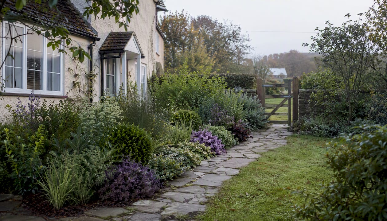
Photo-overlay or photomontage work is the workhorse of client approval. Placing the proposed planting directly onto a photograph of the client’s actual site collapses the abstraction gap almost instantly, because the client is looking at their own garden, not a generic illustration.
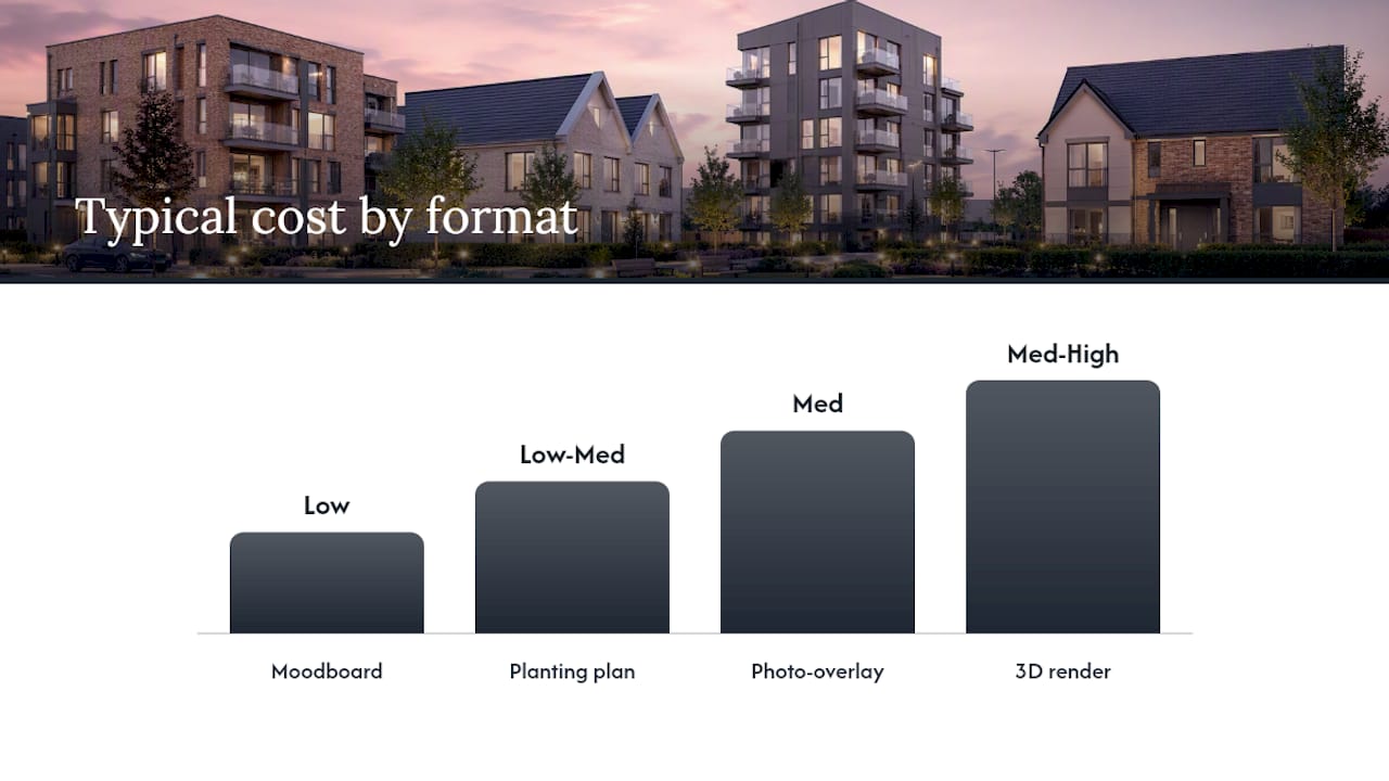
3D renders earn their cost at pre-approval and planning stage, where lighting, seasonal variation, and camera angle need full control, and where a planning committee needs an accurate, defensible depiction rather than an artist’s impression.
| Format | Best used at | Realism | Typical cost | Lead time | Edit flexibility |
|---|---|---|---|---|---|
| Moodboard | Early concept | Low | Low | Short | High |
| Planting plan | Design development, contractor briefing | N/A (technical) | Low to medium | Short | High |
| Photo-overlay/photomontage | Pre-approval, client sign-off | High | Medium | Medium | Medium |
| 3D render | Planning submission, final sign-off | Very high | Medium to high | Longer | Low once modelled |
For deliverable specs: supply screen visuals at standard web resolution (typically 72 to 150 DPI, sRGB) and print or planning submission files at 300 DPI in CMYK or as specified by the local planning portal. Mismatching these two is one of the most common, and most avoidable, causes of rework.
The research behind why realistic visuals speed approval
None of this is intuition dressed up as expertise. There’s a body of research explaining exactly why realistic planting visuals change how clients decide.
The picture-superiority effect demonstrates that concrete, literal images are remembered and understood far more reliably than symbolic representations like plans or written descriptions. A client who has seen their garden with the proposed planting carries that image into every future conversation about the project, which is partly why accurate previews also function as a quiet referral engine, clients who can picture the result describe it more clearly, and more confidently, to friends and family.
Construal level theory adds the second half of the explanation. Depictive realism reduces what psychologists call psychological distance, and research on visual realism has found that more realistic imagery increases perceived proximity and readiness to decide, an effect that’s stronger for some viewers than others depending on their own spatial imagery ability. Put simply: showing the planting on the client’s actual property photo, rather than a generic stock scene, moves the idea from “someday, somewhere” to “here, soon.”
Then there’s biophilia. A large Rutgers analysis of over 40,000 sold properties found that listings with more biophilic imagery, plants, greenery, natural elements, sold faster and at higher prices. Follow-up experiments in the same body of work found that exposure to plant imagery reduced anxiety and increased willingness to commit. Separate research on plant imagery and consumer engagement found similar effects: seeing plants reduces the psychological friction that comes with uncertainty.
The practical takeaway is simple. Push realism as high as the budget allows, always anchor the render on the client’s real context, and never show planting in isolation when you can show it settled into its actual surroundings.
The approval-ready deliverable checklist
A studio that wants to shorten its average approval time should standardise what it sends every client, rather than reinventing the deliverable list project by project.
- Context photomontage — the proposed planting overlaid on a genuine photo of the client’s own site, not a stock or generic scene.
- Seasonal pair — at least a summer and winter view of the same composition, so dormancy isn’t a surprise later.
- Maturity timeline — install-stage and three-year (or agreed milestone) views of the same planting, clearly labelled.
- Annotated plant list — common names first, botanical names second, with mature height and spread noted against each.
- Maintenance note — a short paragraph tying specific plants to their care requirements and rough annual cost.
- Budget summary — linking the visual directly to a cost range, so approval and pricing happen in the same conversation, not two separate ones.
Label every file consistently, project name, view angle, season, and date, so a client or planning officer reviewing files months later can still tell what they’re looking at without opening a covering email.
On options: present two, at most three, distinct planting directions rather than five or six minor variations. Too many choices don’t give clients more control, they give them decision paralysis, and a stalled decision is functionally the same as a rejection.
Presenting planting visuals in a way that actually gets a yes
The order you show visuals in matters almost as much as the visuals themselves. Open with the context shot, the client’s own site, recognisable and grounded, before introducing any proposed change. That single step does more to reduce psychological distance than any amount of render quality.
From there:
- Lead with one strong focal view of the preferred direction, not a gallery of every angle you’ve produced.
- Follow with annotations, plant names, key maintenance notes, cost implications, layered onto the same image rather than a separate document.
- Close the options set with no more than three alternatives, each visually distinct enough that the client can genuinely tell them apart at a glance.
Ask decision-focused questions rather than open-ended ones. “Which of these fits how you actually use the garden?” gets a faster, clearer answer than “What do you think?” The former assumes movement toward a decision; the latter invites a stall.
Watch for specific feedback patterns that signal trouble. Vague comments like “I need to think about it” usually mean the client hasn’t fully understood what they’re looking at, not that they dislike it. Comments about cost that arrive after they’ve seen the visual usually mean the maintenance note wasn’t clear enough. Both are fixable by tightening the visual, not by chasing the client for a decision they aren’t ready to make.
Briefing a visualisation studio for planning-grade planting visuals
Commissioning accurate planting visuals from a specialist studio works far better when the brief is structured, not a loose email with a few attached photos. A brief that saves rework typically includes:
- Project context — address, orientation, and existing site photography taken in good light with a wide field of view.
- Target audience for the visual — homeowner client, planning committee, or investor deck; each needs a slightly different emphasis.
- Required formats — moodboard, photomontage, 3D render, or a combination, tied to the approval stage.
- Seasonal requirements — how many seasonal variants, and which seasons matter most for this specific scheme.
- Maturity and scale notes — install-stage sizes and target mature sizes for every species featured.
- Plant tagging specification — a simple CSV or spreadsheet listing common name, botanical name, quantity, and size, so nothing gets substituted without sign-off.
Supporting files matter as much as the brief text. Source photography should be high-resolution and shot straight where possible; LiDAR or point-cloud data, where available, speeds up accurate spatial placement considerably. Consistent file naming, project, view, date, revision number, prevents version confusion once a scheme goes through two or three rounds of feedback.
Planning-grade visuals carry a different burden than marketing visuals. A planning officer isn’t being sold a lifestyle, they’re assessing whether a scheme’s impact matches what’s described in the application. Accuracy in scale, species, and seasonal appearance isn’t a nice touch here, it’s the difference between an application that sails through and one that gets queried for clarification.
Studios working across planning applications understand this distinction well: a render built for a brochure and a render built to withstand planning committee scrutiny are not the same deliverable, even when they use the same underlying model. Getting that brief right the first time avoids the costly rebuild that happens when a studio discovers, three drafts in, that the visual needs to satisfy a local authority’s evidential standard rather than a client’s aesthetic preference.
What studios get wrong about planting visuals
The most common mistake isn’t poor rendering quality. It’s showing a client a beautiful, fully mature garden with no timeline attached, and letting them assume that’s what they’ll see on day one. That single omission causes more disputes than any technical flaw in the visual itself.
The second mistake is treating planting visuals as an afterthought to the hard landscaping render. Plants often get added last, at lower resolution, with less attention to species accuracy, because the paving and structures feel like the “real” content. Clients notice this asymmetry even when they can’t articulate it. A polished patio next to a vague green blob reads as unfinished, no matter how good the hardscape looks.
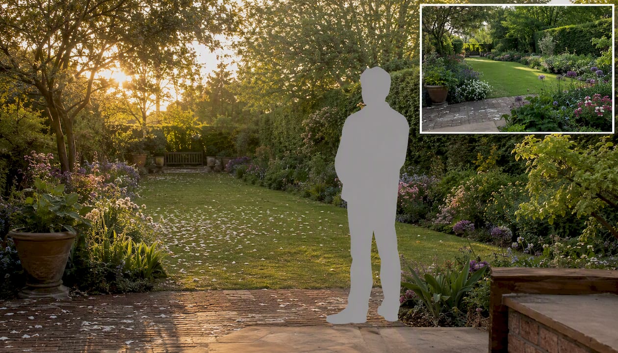
A useful habit from practice: include a scale human figure and a seasonal inset on every planting visual sent for approval, no exceptions. The figure gives an instant, intuitive sense of height that measurements alone never achieve. The inset, a small secondary panel showing the same view in a different season, pre-empts the “what does it look like in winter” question before it’s ever asked.
Pro Tip: Treat every planting visual as if a planning officer, not just the client, might one day need to interpret it. That discipline, accurate scale, honest maturity staging, correct species, rarely costs more time to produce, and it protects the studio’s credibility either way.
Get planning-ready planting visuals without the guesswork
Visual Trick produces planning-grade CGI and photomontage specifically built to remove the ambiguity that stalls client sign-off, accurate scale, honest maturity staging, and context photography that shows a scheme on the client’s actual site rather than a generic stand-in.
Where a rough render or an in-house sketch leaves gaps a client has to fill in themselves, a properly briefed studio deliverable answers those questions before they’re asked. That matters most on schemes headed for planning submission, where an officer needs defensible accuracy, not artistic impression, and on exterior CGI work where seasonal and maturity staging directly shapes whether a client approves on the first pass or the third. Studios working alongside architects and designers can also draw on established guidance for why architects use 3D visualisation to structure their own client conversations. For marketing-facing visual work more broadly, the wider case for investing in visual content applies just as directly to planting schemes as it does to any other product.
Get in touch with Visual Trick to brief your next planting scheme and see a sample photomontage before you commit.
Sources
The claims in this article draw on a mix of behavioural psychology and applied property research, worth reading in full if you want the underlying evidence.
- The Picture-Superiority Effect: Harness the Power of Visuals – NN/G
- Can your eyes taste freshness? The role of visual realism, motion cues, and spatial imagery ability in juice packaging – Frontiers
- Biophilic imagery and property valuation (Rutgers repository)
- Visual plant imagery and consumer behaviour (doctoral/research DOI record)
- Visual features of indoor greenery and restorative response – MDPI Land
